

Break-thru with impact.connection.differentiation.innovation.originality.vision.creativity.
We’re honest, not modest. Explore what happens when strategy, design, and development go all in on digital experiences.
Spotlight
projects
Our favorite projects aren’t just pretty. They tackle complex problems to realize tangible business goals. From life sciences and tech to hospitality and real estate, we partner with organizations of all sizes. We make your business our business.
filter by:


ProjectNext Leadership
Bringing out the humanity in leadership.
ProjectNext Leadership embarked on a journey to redefine their brand from the inside out. Known for their deeply human approach to executive development, they needed a brand that reflected not just what they do, but who they are. Through our collaborative process, we helped ProjectNext Leadership clarify their brand truth, explore their leadership soul, and articulate their unique market presence with authenticity and confidence.
Industry
Education
511.org
Personalizing the Bay Area Commute!
The Metropolitan Transportation Commission (MTC) rolled out a new website with improved tools and resources to help San Francisco Bay Area commuters get around. 511.org is a one-stop phone and web source for up-to-the-minute Bay Area traffic, transit, rideshare, and bicycling information. Known for it’s reliable information, 511 is a trusted source for the people of the nine counties it serves. What was needed though, was a creative boost with their campaigns to help promote 511’s relevance, new services, and drive traffic to it’s new site and phone lines.
Industry
Community
McMillan
Driving a Visionary Industry Leader future-forward
McMillan Electric is the Bay Area’s leading electrical contractor. 10 years ago when we met, they were a small, single family shop still doing mom and pop jobs. Today’s McMillan Electric is a multi-million dollar enterprise powerhouse with multiple locations, cutting edge technology, a strong leadership culture, and the most ambitious work-ethic we’ve ever seen… and we work with 20/7 start-ups! Evolving their brand was a no-brainer.
Industry
Real Estate
Stanford Jazz Festival
Unleashing a Campaign with Radiant Rhythm
For over four decades, Stanford Jazz has been bringing the best jazz performers and educators together with students of all ages. As one of the leading jazz organizations in the world, they have a roster of artists and NEA Jazz Masters that reads like a “Who’s Who” of jazz history. As agency of record for the last decade, 300FeetOut partners with the executive team for yearly creative campaigns that speaks to jazz lovers of all ages while maintaining brand consistency for both the Stanford Jazz Workshop, the Stanford Jazz Festival, and affiliated events.
Industry
Community
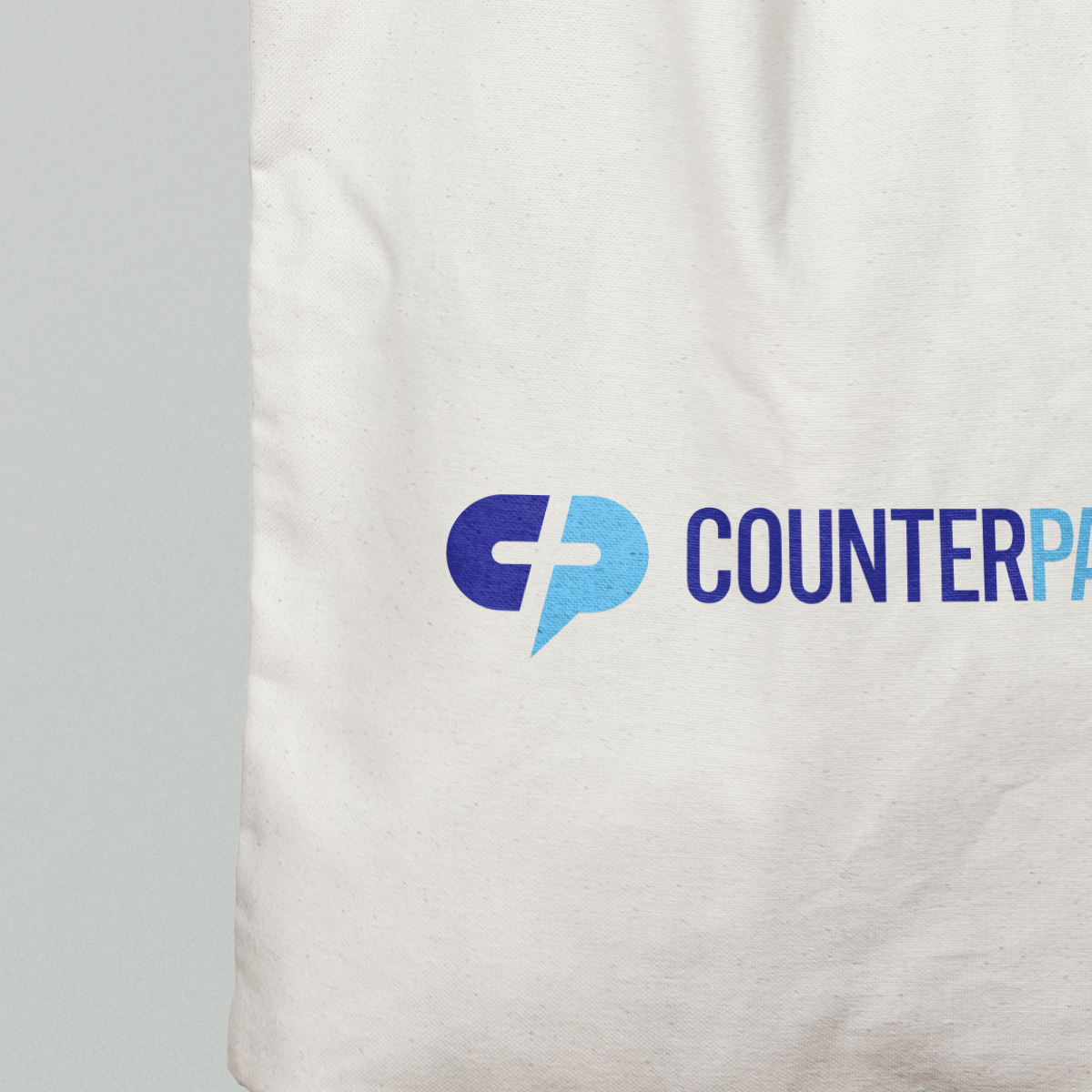
CounterPart Ventures
Shaping a Brand with Conviction
In early summer we were approached by a mysterious man and a company with no name. He and his partner were small, nimble, and had an upcoming deadline for a large international meeting. He was honest with us, he’d done his homework. He was starting out in a well established, crowded field where most of the ‘good’ names were already taken. After trying to come up with a name himself to no avail, he started reaching out to other agencies and was hunting for the “right fit”.
The ‘right fit’ is often code for a tiny budget, unreasonable expectations, or a lack of faith in the experience an agency like 300FeetOut brings to the table. However, this client had an easy smile with a no-bullshit yet friendly demeanor, something that innately appealed to us, so we fearlessly engaged.
Industry
Financial
Edios
A Media Brand ready for its lose-up
Edios Media is a video production agency that’s reimagining the way people learn. By creating powerful e-learning solutions and online courses, they inspire and engage learners through storytelling. With a run of success with clients like Google, Facebook and Salesforce, they tapped 300FeetOut to up the ante of their brand presence.
Industry
Education
Smuin Ballet
Campaign Artistry. Contemporary Twist.
For more than 20 years Smuin Contemporary American Ballet has pushed beyond the expected with a distinct performance style and impressive repertoire of choreography. 300FeetOut jumped at the challenge to capture Smuin’s charismatic energy and unique blend of drama and delight in their 2017/18 campaign.
Industry
Community
Arbor Cafe
A Brand Built to Weather a Pandemic
Our longtime San Francisco clients, The Absinthe Group, set out to create a new restaurant concept in the heart of the city. The idea was to bring home style cooking to a neighborhood filled with families, tech workers, and patrons of the arts; building a brand that resonated with people both looking for dinner before the opera or ballet and local resident passerbys.
Industry
Hospitality
Arlequin Wine Merchant
Appealing to the Modern day Connoisseur
Not often does a brand agency get to revitalize a brand they created 20 years ago. 300FeetOut was lucky enough to get that opportunity with Arlequin Wine Merchant. A wine store for wine drinkers in the know, Arlequin has deep expertise in the industry, a massive inventory, and a knowledgeable charismatic team. They also had a brand, website, and brick-and-mortar strategy conceived before the wine barrel.
Industry
Hospitality
Park Central New York
Classic Sophistication, with a Modern Twist
Classic sophistication, with a storied past. Built during the glitz and glamor of the Roaring Twenties, Park Central New York is the Midtown Manhattan hotel with an iconic past that had lost it’s way. 300FeetOut designed a site that appeals to today’s modern guest who appreciates a destination with true heritage, and the sophistication of a newly reinvented hotel.
Industry
Hospitality
TYPO Int'l Design Talks
All Eyes on a Friendly Campaign with Unique Shifts in Focus
When Monotype purchased The FontShop, they also took over the Typo International Design Talks conference. Once again, 300FeetOut stepped up to the plate to brand the conference. Given a single word, “Focus”, we created a personable campaign that was friendly and fun yet provoked engagement.
Industry
Community
San Francisco Ballet
Capturing the Anticipation of the World’s Most Refined Ballet
Founded in 1933, the San Francisco Ballet is America’s oldest professional ballet company. They are not only known for having one of the most diverse repertories in the dance world, but also for their reputation as a company dedicated to sharing the joy of dance and powerful entertainment with audiences in their community and around the globe. To translate their mission and passion, 300FeetOut was chosen to design their 2014 Repertory Season advertising campaign.
Industry
Community
San Francisco Ballet Nutcracker
A Modern take on a Uniquely San Francisco Holiday Tradition
On Christmas Eve, 1944, the audience at the War Memorial Opera House sat in hushed reverie as the house lights dimmed, the music began, and the curtain rose on the American premiere of Nutcracker. An instant sensation, the ballet launched a national holiday tradition. Nearly 70 years later, before the stage lights were set to illuminate the dancers once again, The San Francisco Ballet chose 300FeetOut to reinvent the Nutcracker identity and to design a new advertising campaign for the world-renowned performance.
Industry
Community
Bal Harbour Village
A World-Class Experience for a Simply Elegant Destination
The village of Bal Harbour is in an enviable position – located between two of Florida’s most famous hotspots, Ft. Lauderdale and Miami. But it is also a destination in its own right, with an array of fine hotels and upscale restaurants. And for more than 40 years, its Bal Harbour Shops mall has been a favorite among luxury shoppers.
Bal Harbour’s Director of Tourism looked to 300FeetOut to create a website experience that would let the world know the village not only offers a world-class shopping experience, but is a center for high-style fashion, cultural events and the socialite scene – and a great place to stay and unwind.
Industry
Hospitality
Boston Park Plaza
An Open Invitation to Boston's Landmark Destination
Boston Park Plaza is a beloved destination cherished by generations. For 90 years the landmark has been the heart of Boston, welcoming all but two U.S. Presidents during that time. More recently, though still an iconic part of the city’s mythology, the hotel had fallen from a bit from it’s lofty perch. While still a destination for your grandparents anniversary, son’s graduation, daughter’s wedding and your 2pm meeting; the hotel had become known as “sleepy and old fashioned”. Now it is fully restored and reimagined through a $100 million renovation, the hotel offers the vibrancy and style of today, with a spirit inspired by its past. To welcome it’s guests back, the hotel tapped 300FeetOut to bring this new experience to the web.
Industry
Hospitality
Waikiki Parc
Vibrant Storytelling Engage Active Users
Waikiki Parc is an urban hotel in a resort destination. It offers guests a great location and good value for their holiday. The Parc experience speaks to those who are looking to connect with their location, without being coddled by it. 300FeetOut portrays the Parc experience via energetic visual representation and a welcoming user interface.
Industry
Hospitality
Third Degree Communications
A Communications Brand with Candor
Since 2004, Third Degree Communications (TDC) has provided training programs designed to enhance the skills of law enforcement, corrections, PR, crisis, and HR department personnel. After years of building a community of trust, with a reputation for a solid foundation of classes and sell-out content that draws students from around the country, the team at TDC decided to update their brand in order to serve the next generation of leaders.
Industry
Education
Aspen Snowmass
Whetting any Snow Lover’s Appetite
With four very diverse mountains and two unique mountain towns, Aspen/Snowmass has long been known as an exclusive wonderland. The famed Rocky Mountain resort invited 300FeetOut to “brand” their 2010 winter season with an Aspen/Snowmass website nearly as expansive, inviting, and lively as the real thing. The goal? Invigorate the seasoned Aspen/Snowmass community while also extending a welcome to families, beginners and guests with any vacation budget.
Industry
Hospitality
Beach Blanket Babylon
Big Hats and Big Laughs require Big Creative
In it’s 41st year and with over 15,000 performances under its belt, Beach Blanket Babylon is a San Francisco favorite. Reminding audiences of how relevant and funny the show can be is a task 300FeetOut has taken on for a decade. Coming up with new campaigns, we take advantage of new design trends and technologies to drive traffic to the box office. From in-your-face graphics to amusingly staged character scenes the advertising and push for BBB is always one word — fun!
Industry
Community
The Wagner
Rediscovering Manhattan's New Downtown
Hotels often change hands as was the case for this iconic Battery Park Hotel in New York City. The new management team needed a website built for the Leading Hotels of the World member property quickly and with little brand guidance or available assets. Following a quick property visit to acquaint ourselves, we worked quickly to create an immersive digital experience for this luxury property by highlighting it’s Battery Park location—Manhattan’s “new downtown”.
Industry
Hospitality
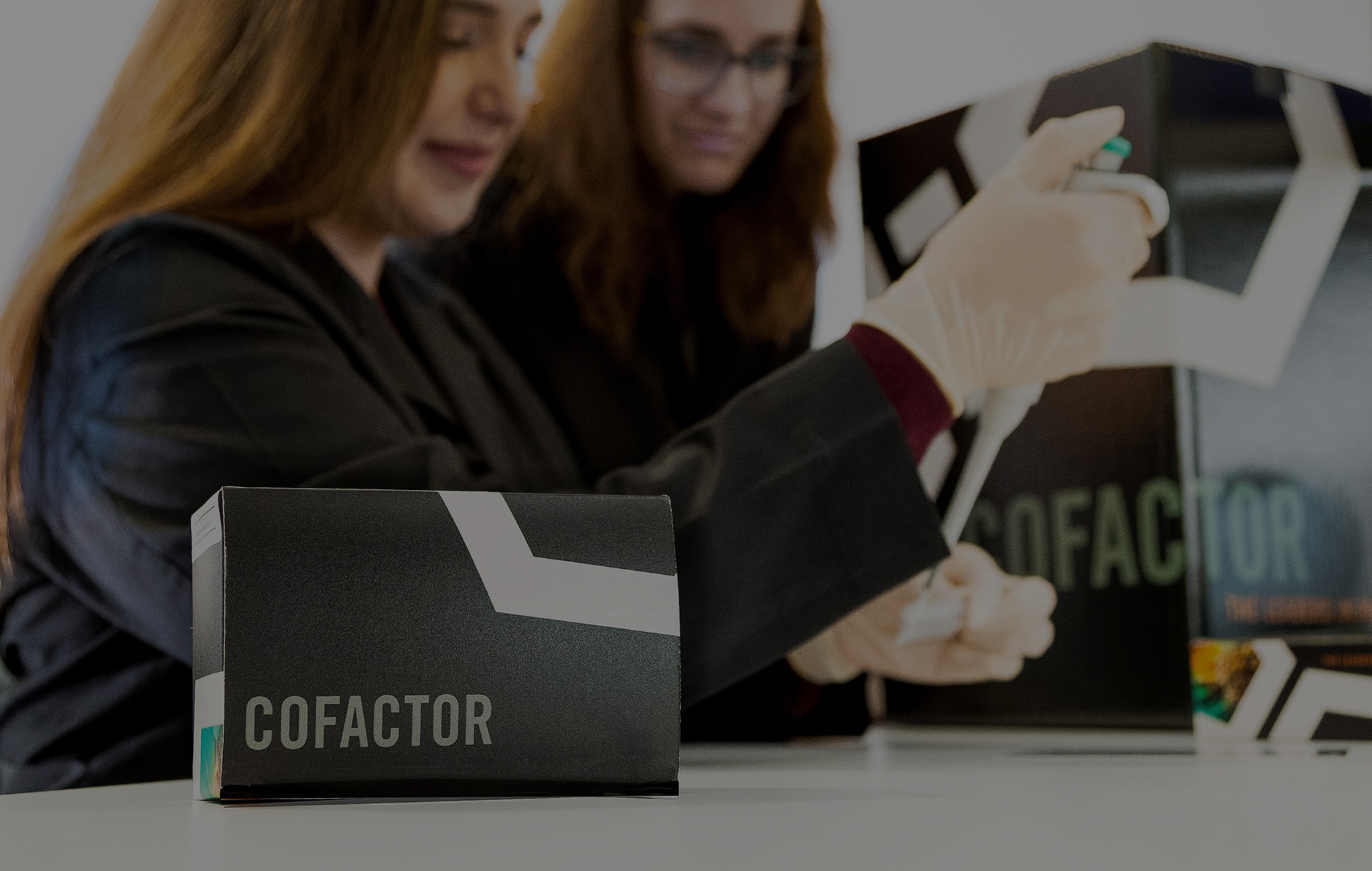
Cofactor Genomics
Pivoting Biotech from Service to Product
A leader in precision medicine, Cofactor Genomics uses RNA (remember biology class?) to help make personalized decisions for patients via machine learning. Changing their business strategy from service to product, they needed a consistent brand to support this pivot.
Industry
Life Sciences
Walt Disney Family Museum
Creating a Virtual Home for the Man behind the Mouse
“If you can dream it, you can do it.” That’s the spirit behind the Walt Disney Family Museum, devoted to the visionary who spoke those words and proved them true. Housed in San Francisco’s Presidio, the Disney family’s private collections showcase how creativity and innovation change the world. Not to be fooled by it’s historic red brick facade, inside, visitors marvel a powerhouse of technology, innovation and high-tech interactivity. This is what the museum needed to convey to the public. 300FeetOut embraced the two, old and new, creating a site true to it’s roots.
Industry
Community
The Dunmore
Translating Contemporary Tranquility
The Dunmore property was one of the first resort destinations on Harbour Island. This sought-after location in The Bahamas is celebrated for its tranquility, beauty and pink sand beaches. The resort had recently been purchased by a group of investors who loved the charm and simple elegance of the property, but wished to add some contemporary comforts.
Industry
Hospitality
DNA Ink
The perfect blend of Precision, Process and Personality
DNA Ink is a new company founded on the expertise of its partners, gained through decades at Genentech and elsewhere in the life-sciences industry. They work with clients to find the right partner for their clients’ products, then market, develop, structure and negotiate the deal. Through their work, start-ups receive the funding and market reach needed to get a life-enhancing product into the hands of patients.
Industry
Life Sciences
Culina
Giving the Beverly Hills Restaurant a site with Flavor
The Four Seasons Hotel needed a website to showcase Culina as a sophisticated neighborhood dining experience – accessible, affordable and committed to serving fresh, locally sourced food. (Did we mention Culina also features the only crudo bar in Los Angeles? Yum!) 300FeetOut collaborated with Culina’s architects, chefs and management staff to create a website experience that underscores why Culina, Modern Italian is a standout dining destination – and by no means just another “hotel restaurant.”
Industry
Hospitality
Stern Grove Festival
A Kick Back Campaign drives an Engaging Experience
Some of our favorite types of projects are those located in our small San Francisco backyard. The Stern Grove Festival Association is an organization committed to providing the people of the Bay Area with admission-free access to diverse performing arts since 1938, making it the oldest in the United States to do so. From the world famous San Francisco Ballet to local musical groups, enjoying a day watching the stage with friends while relaxing on the grass in the Sigmund Stern Grove, a beautiful outdoor amphitheater, is truly a uniquely homegrown experience.
Industry
Community
Shelter
It’s all in the Details
When function meets art, we call it interior design. Shelter interior design came to 300FeetOut needing a brand identity and brand collateral to represent their work aesthetic. Armed with pantone books, enough paper swatches to fill a library, and typefaces so unique that they were almost indistinguishable — we created a brand that was minimal, yet all about every detail.
Industry
Community
The Setai
An Opulent Experience with a Burnished Allure
Subtle yet lavish, serene but luxe, The Setai is the crown jewel of Miami Beach luxury properties. The oceanfront resort blends Asian-inspired elegance with the high style of Miami’s Art Deco South Beach—and pleases guests with unparalleled service. The challenge for 300FeetOut? Create a website that glows with The Setai’s burnished allure, while also quietly working some high-performance optimization magic.
Industry
Hospitality
re:find
A clearly better way to enjoy a Vintner’s Saignée
During harvest, the winemakers at the Villicana Winery capture and ferment the bleed, or “saignée”, of their grapes. Generally, the saignée is turned into a rosé wine or is not used, and therefore drained away. The owners realized that they could use this saignée to create something truly distinct, a vintner’s vodka. The result is less waste, more choice and a unique, local product. The graphic language reflected this underground, irreverent, cult-like brand, to create a memorable label for a memorable product.
Industry
Hospitality
Punta Cana International Airport
Designing Paradise’s Portal
An airport is a place of steel and tarmac—yet Punta Cana Airport in the Dominican Republic is also a portal to balmy sea breezes and white sand beaches. Serving one of the world’s premiere resort areas, Punta Cana is among the busiest airports in the Caribbean, and also one of the most welcoming, with chic modern furnishings and an island-idyll color scheme. When 300FeetOut set about designing the Punta Cana Airport’s new website, we went after that perfect balance of strength and beauty.
Industry
Hospitality
Pasolivo
Handcrafted Design for a Handcrafted American Olive Oil
Pasolivo of Paso Robles, California, presses, bottles, and markets its own olive oil. From the tree to the table, it’s all done organically and sustainably on the farm. Food critics and customers expect an earthy, full-flavored olive oil from the award-winning Pasolivo brand. As the oil’s popularity grew, so did the owners’ desire for a new identity and packaging that reflected those qualities.
Industry
Hospitality
Park Central San Francisco
The Essence of San Francisco in the Heart of Soma
When Highgate Hotels took over the management of Park Central San Francisco they had some big shoes to fill. The former Starwood property need a complete digital overhaul. With the successful launch of Park Central New York, we were able to create an umbrella brand that took the fledgling San Francisco property under it’s wing. The property branding was flexible (read between the lines as practically non existent) and needed to be completed in under 45 days.
300FeetOut pulled out all the stops and created a stand alone San Francisco branded site that firmly placed the hotel in the heart of the City.
Industry
Hospitality
Nichols Booth
A Blueprint for a new brand of Architecture
From the big, bold statement to the tiny, yet eloquent detail, the power of design is the stock-in-trade of interior architects Douglas Booth and Gary Nichols. So 300FeetOut was flattered when we were tapped to create an identity system for NicholsBooth, their newly merged firm. NicholsBooth needed a distinctive new brand identity; Douglas Booth Architects (dbA) has been acclaimed for meticulous historic renovation, while Gary Nichols’ renown skews more future-forward. The combination, NicholsBooth, projects a fresh, hip edge and a broad spectrum of talents.
Industry
Real Estate
The Missing Leg
A Compelling Brand with a Compassionate Story
The Missing Leg is the culmination of over 25 shared years of production and hospitality experience in California’s Central Coast wine industry. Owners, Karl and Heidi Wicka, have witnessed first hand the unbelievable coming of age of Paso Robles as a world renowned wine destination. The Missing Leg creates quality, limited production wines that reveal the secrets learned along their incredible journey. In creating their brand, 300FeetOut had three goals: To design an evocative brand identity, catch the eye of consumers with a visually recognizable label, and to tell a story—honoring the memory of his father, Ronald Wicka.
Industry
Hospitality
K+K Hotels
A Strong Corporate Brand gets an Appealing Makeover
300FeetOut embarks on a whirlwind trip to the hottest spots around Europe. From London to Budapest, K+K Hotels is a brand of boutique hotels with unmistakable character and stylish ambiance in the best European city-center locations. Providing free high-speed wifi and a full breakfast to rival top international hotels, K+K Hotels has created a fiercely loyal following, unsurprising for a brand that values customer service and guest comfort above all else. What K+K Hotel needed was some modern appeal.
Industry
Hospitality
Kamalan
Responsive Design for a different kind of Traveler
Calling all global citizens wanting memorable and unique cultural experiences – look no further than Kamalan Travels! As a diverse group of cultural ambassadors, Kamalan assists travelers by planning personalized itineraries through India, allowing them to immerse themselves in the true culture of the people and the country.
Industry
Hospitality
Halekulani
A Serene Digital experience for the House befitting Heaven
When a luxury hotel with nearly 100 years of legacy calls 300FeetOut, we hop on the first jet to Honolulu. Halekulani, Hawaiian for “House Befitting Heaven”, is located on the beach at Waikiki. With a reputation for gracious hospitality and impeccable service, they needed a website that enveloped users in the same oasis of serenity that makes Halekulani highly sought after as a top International resort.
Industry
Hospitality
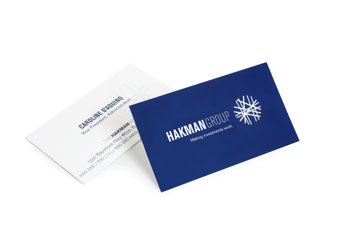
Hakman Group
Clarity amongst Chaos and Complexity
The Hakman Group provides professional value-added services within highly specialized asset classes and draws upon their industry knowledge, trusted relationships and proven methodology to execute complex transactions. With their 180 combined years of marine container business experience and expertise of negotiating and structuring highly complex transactions, Hakman Group was missing only one important thing—an identity.
Industry
Financial
Grace Bay Club
A Digital Experience complements a Timeless Destination
Grace Bay Club in the heartachingly beautiful Turks and Caicos Islands of the Caribbean is known for creating individualized, “handmade experiences” designed to turn “every guest into a lifetime guest.” Owner, Grace Bay Resorts, wanted the luxury hotel’s website to reflect the timeless destination—a slick, contemporary resort with hands-on personalization of every guest’s stay in this tropical paradise.
Industry
Hospitality
Grace Bay Resorts
The Brand behind the Handmade Experiences
The team that brings together Turks and Caicos is Grace Bay Resorts. They operate luxury hotels and residential properties that deliver memorable handmade experiences. They also provide an excellent return to owners and other investors who are looking to expand their portfolios. As they say on their site, transformative brands and incomparable destinations are built on exceptional people. This includes the 300FeetOut team that built a destination website which tells a story, yet provides solid basis for investment opportunities.
Industry
Real Estate
Fudge is my Life
Sweetening the appeal of a Down-home Chocolate Sauce
Fudge is My Life® founder Lillian Maremont began conjuring hot fudge sauce in her San Francisco kitchen in 1963. Before long, she was collecting blue ribbons at community events and county fairs. For decades, her magic recipe has delighted San Francisco natives and newcomers alike, from gleeful neighborhood kids to discerning socialites. No longer able to keep up with the demand, Maremont decided to move her operation out of her kitchen and into full production. To develop packaging as delectable as her fudge, she turned to 300FeetOut.
Industry
Hospitality
Fort Mason Center
A Hive of Activity gets an effective Online Makeover
Day or night, there’s no more dynamic a place than Fort Mason Center, where the San Francisco Bay’s shifting play of light and water is the backdrop for theater and dance, workshops and classes, exhibitions and congregations of all sorts. Occupying 13 bayfront acres of a former military base dating back to the Civil War, Fort Mason Center buzzes with activity and energy. In designing the Center’s website, it was essential that 300FeetOut approached the lively diversity of Fort Mason from several angles.
Industry
Hospitality
Dynamo
Because Everyone loves a Good Donut
When a famous pastry chef comes to you with an idea for artisanal doughnuts and offers up a lifetime of baker’s dozens in exchange for a logo, who are you to say no? Cool before hipster was a word, hipster before hipster was cool, and destroying diets with bacon — dynamo doughnuts single handedly changed the landscape of San Francisco mornings. We created a visual identity that was organic, true to the hard work of getting up to bake at 3am, and maintains a retro flare for when mom’s cooking was all you needed to start your day. And …bacon!
Industry
Hospitality
Sterling Becker
An Online Showcase for design found in every Home
Well-known for their packaging for clients such as Microsoft, WholeFoods, Nestlé, Peet’s Coffee, Del Monte, and more, PhilippeBecker approached 300FeetOut to develop a website to showcase their work. The website served PhilippeBecker very well for four years. After a recent merger with Sterling Brands 300FeetOut was tapped once again. Sterling Becker, as they are now known, needed a site that reflected the new partnership, work, and modern technology of today.
Industry
Hospitality
The Content Bureau
Smart Branding for a Witty Content Bureau
Industry
Hospitality
Triton
Celebrating a Global Container Lessor’s Silver Anniversary
Cargo shipping is a brawny and competitive industry, and Triton Container International Limited efficiently runs a hardworking fleet. When Triton celebrated its 25th anniversary, its founders had a chance to show off their aesthetic side with a celebratory keepsake book on “The Triton Story” for employees and friends around the globe.
Industry
Community
San Francisco Opera
Broadening the appeal of the Magic Flute and Don Carlos
Imagine twenty-somethings choosing opera over the latest rock concert. That’s exactly what we had in mind when the San Francisco Opera approached 300FeetOut with the goal of bringing new audiences and single ticket viewers to the opera. In fact, the new advertising campaign, designed by 300FeetOut and launched in conjunction with the opening of the 2003-04 opera season, has made it hip to score opera tickets.
Industry
Community
©2026 300FeetOut All Rights Reserved | Privacy Policy