16 tips to designing UI for an aging population

Greg Ciro Tornincasa
5 minutes
Working in the youth-saturated tech industry of Silicon Valley, it’s easy to get tunnel vision thinking everyone is young, rich, and influential on TikTok. However looking into analytics or accessibility reports and you’ll see that those people are totally missing a HUGE segment of our population. 50+ is a massive demographic and with the advent of Covid-19, they’re throwing their weight around online more so now than ever.
One of our clients is laser focused on this older demographic and they hired 300FeetOut to provide better online experiences. So in addition to our usual accessibility work, we’ve been attending webinars and online meetups, foraging through industry and medical data, and hitting the books (seriously, my boss delivered this one to my doorstep) to learn the latest on providing a good UX for seniors by means of a better UI.
The icing on the cake here is that we already use most of these recommendations for the elderly to meet accessibility standards in our day-to-day work for the younger TikTokers. Because they not only provide an easier user experience for everyone, but a more efficient one. To help you better understand what functions they help serve, we’ve divided these tips into 3 sections: vision, motor control, and cognition.
vision
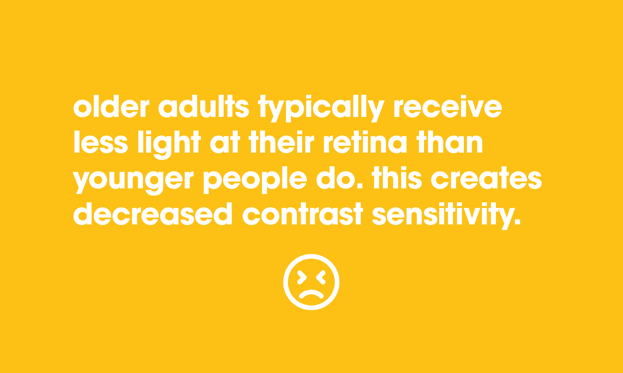
1. provide contrast
Above age 50, many people notice a decline in their ability to see subtle differences in shades of gray or any other color. Information that contrasts poorly with its background, over images or patterns will be hard for older adults to see. Avoid lots of text overlay treatments without enough contrast.
2. legible fonts
Use large font sizes. At least 14pt for body text. Plain fonts provide better legibility than fancy display fonts or light weight fonts. Stick with san-serif (especially for body text), and mixed case (AVOID ALL CAPS). Make text enlargeable with text adjustment controls.
3. prominent controls
Make sure main elements like links, hover states, menus, and buttons stand out by styling them very different from non-clickable ones.
4. visual consistency
Maintain a consistent use of fonts, icons, color, and layout of sections so that your users becomes quickly familiar with how you’re presenting the information to them – they shouldn’t have to learn too many new ways to consume information from section-to-section or page-to-page.
5. less scrolling
Minimize vertical scrolling (not to the point where you throw information hierarchy out the window to get everything above the fold! but avoid throwing everything on one page). Don’t even think of horizontal scrolling. Even I can’t handle that (well I AM over 40). And clearly indicate that content continues below with a “scroll down” indicator.
motor control
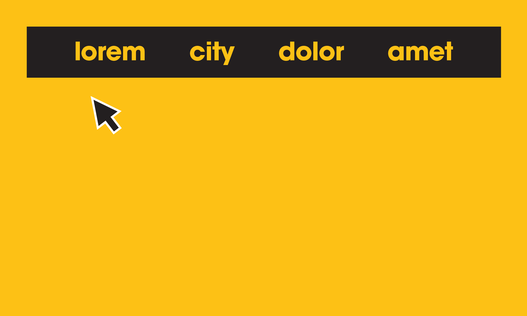
6. multilevel menus
Try to avoid multilevel menus. We wouldn’t go beyond two levels. Design carefully by increasing height and size of menu items, making the targets easier to click.
7. forgiving menu path
Don’t require users to keep the pointer within a narrow path while moving from main menu to sub menu. Keep the nav dropdown open with a brief “grace period” before it closes when rolling out of it, or by requiring a click outside of the submenu. Imagine a shaky hand having to journey from main nav item, to sub menu item, to page. A quickly collapsing menu can be very discouraging when you cannot stay within its usable path.
8. large interactive targets
Make arrow, buttons, navigation menus, form controls, etc large and easy to click or tap.
9. noticeable target feedback
Make it obvious when a target has been selected. Give plenty of visual feedback that the selection is highlighted with a strong visual cue.
cognition
10. minimize stimuli
Provide the fewest possible choices, CTAs, and interactive elements. Don’t overwhelm users with too many choices or decisions.
11. one page, one task
Allow users to focus their attention one task at a time.
12. eliminate distractions
If the content is purely decorative or does not serve the goal of the page – remove it. Design pages with clear hierarchy and easy to absorb content sections with clear separation between each.
13. avoid animations
While some subtle animations can help engage the user as specific times to help complete a task, do not use animations for the sake of being trendy. Chances are, they are only disorienting and distracting to most users.
14. show Location
Clearly show the current location of the page the user is on by providing legible bread crumbs, page titles, and a site map.
15. don’t Hide Content
Do not hide important information in rollovers for the sake of making things look pretty. Users should not have to hunt for hidden information in order to complete a task. While some functionality helps organize content heavy information, do not hide important information relevant to completing the task.
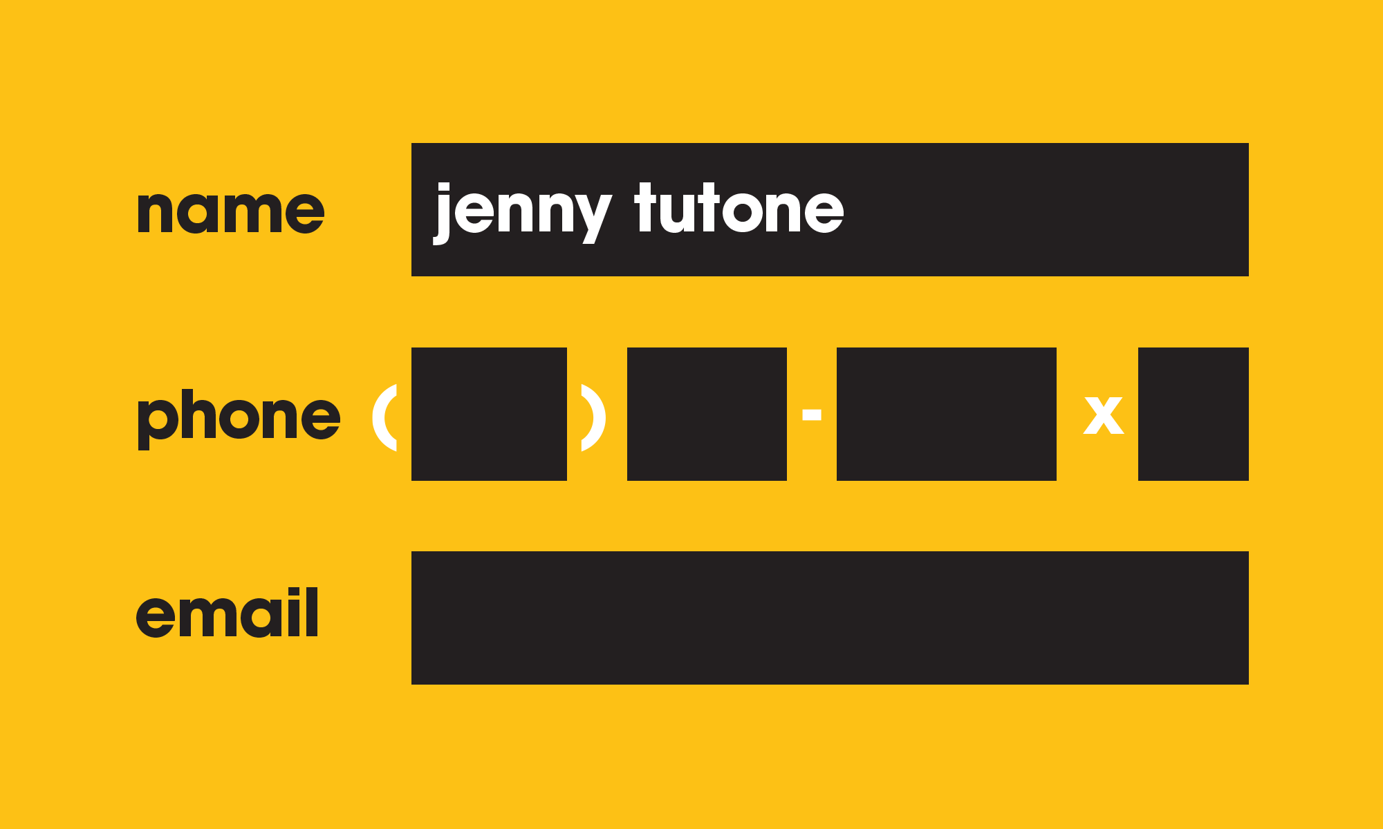
16. pre-format Forms
Pre-format input fields so that users cannot enter invalid values or spend time wondering what is correct and what is not. For instance, when asked for your phone number in one field, how many times have you wondered if you should include your area code, dashes, or extension? Take the guessing out and break the phone number into separate fields. Also provide content hints in the fields to help the user complete the form, provide as little fields as possible, and design large interaction targets with a clean step-by-step layout.
conclusion
Take the extra time to get to know your users. You’d be surprised how much you think you know vs what’s already been proven to help you design the best experience possible. Do it for Frankie and if you can’t figure it out either, dial this number: (415) 551-2377.
—
Some of our many sources:
Jeff Johnson: Designing User Interfaces for an Aging Population: Towards Universal Design
Subtraction.com: Wireframe S3E2: Design Is Why Your Parents Can’t Figure Out Zoom
More
insights
©2026 300FeetOut All Rights Reserved | Privacy Policy