5 UX content strategy tips
Greg Ciro Tornincasa
2 minutes
1. less is best.
You know those restaurants with the huge menus? Choices galore and you’re never quite sure you made the right one. Overwhelmed, you settled for the salad but you wanted the tacos. With too many choices, users get distracted from converting – or give up all together. It’s important to execute your UX site design with limited choices and minimal distractions. This sends your user down the intended path with ease. A CTA button with clear hierarchy and strong visibility will convert better than 4 different enticements fighting for your attention.
Don’t believe us? The jam study tests two tasting tables at the supermarket – one with 6 jams and the other with 24 jams in 2 locations. 3% of shoppers at the 24-jam table bought a jar. 30% purchased from the 6-jam table.
2. words matter.
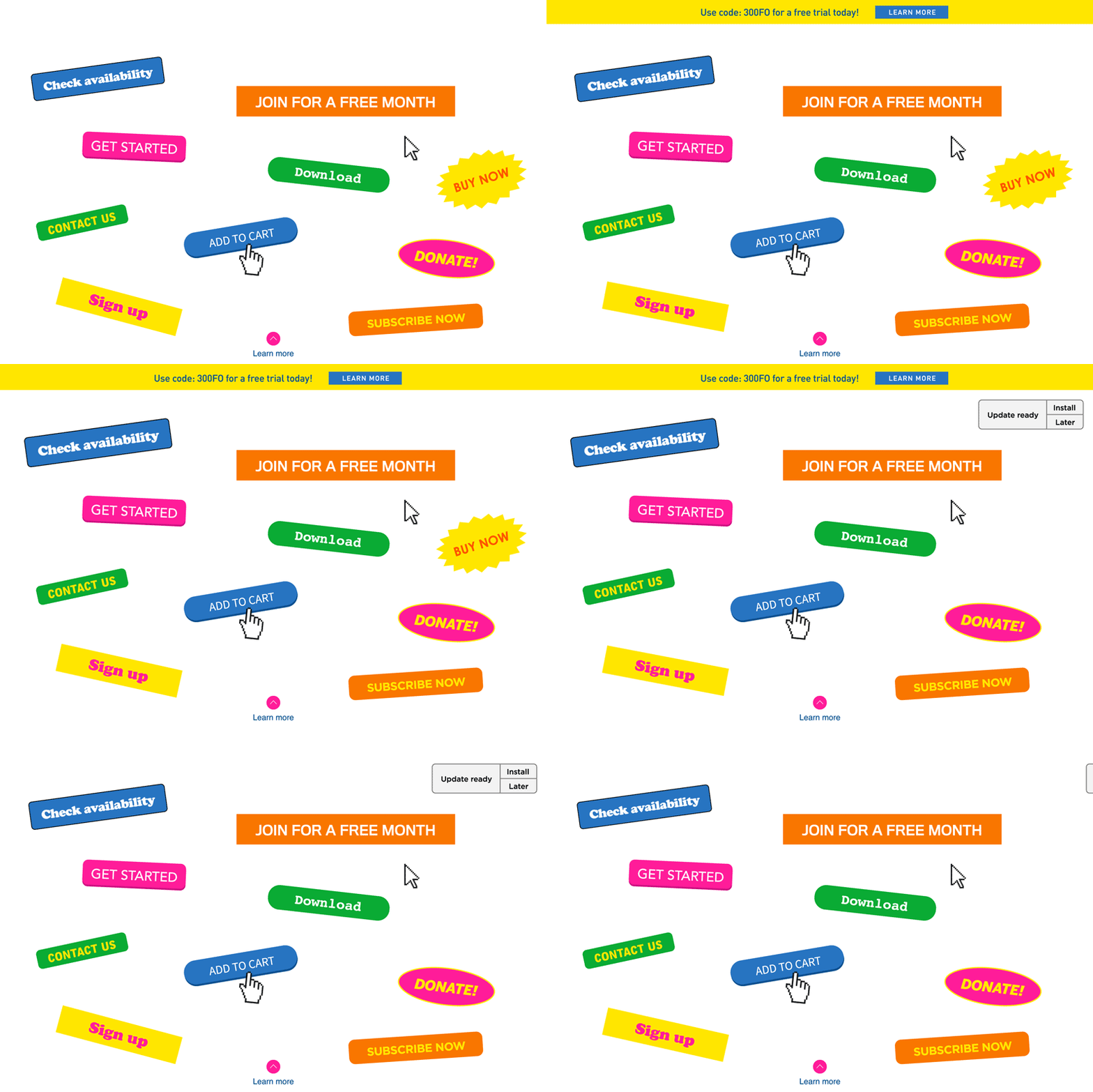
Getting a CTA button to best convert depends on 4 things: placement, shape, color, and message. Focusing on the microcopy of your button can have a large impact on conversions. For example, Google saw a 17% increase in engagement by changing two words. We know most users are noncommittal. Afraid to commit but ready to flirt. Changing “Book Now” to “Check Availability” is less of a commitment and meets the user where they are in their decision making process.
3. give treats.
Everyone wants something for their data these days. Similar to tip 2, give your offer a benefit. How many times have you signed up for an email newsletter just to get that extra 20% off on checkout? How many times have you signed up for a newsletter with a “sign up” button and nothing to give? Exactly. Offer users an enticing benefit to get more clicks.
4. get personal.
Users love personalized content. Segment your audience so that you can tailor the content to their needs and expectations. Research their demographics, background, challenges, hobbies, interests, goals, and fears to create solid buyer personas. Personas will help you create relevant content and a targeted experience with paths for each user to follow easily. On a recent project with Cofactor Genomics, we found that investors tend not to follow the same path as a scientist. For this reason, they get their own main nav item and a page dedicated to their needs. We’ll do these kinds of things for investors.
5. mobile content-first.
Likely your site involves communicating a message, or many messages. While you’re busy creating good UX, tying in SEO, designing for client goals, and collaborating with development, it’s important not to forget about the copy. Designers should be collaborating with writers as often as possible, too. Keep text concise, front-loaded (front-loading: putting what’s important first) and useful. The content-first approach puts emphasis on building a structure that supports the content and presents it the best way possible. Design works around content. The content is what your users need to help achieve their goals (and to satisfy your click counts!)

More
insights
©2026 300FeetOut All Rights Reserved | Privacy Policy