embrace the burger?

Greg Ciro Tornincasa
5 minutes
full-screen navigation trends in hospitality:
an analysis by 300FeetOut
There is a saying you may be familiar with — “pick your battles”? This adage applies not only to life but also to design studios, and team 300FeetOut still bares battle scars from operation “above-the-fold”. Remember back in the day when homepages had no scroll? Everything on the site was crammed into a single view. The imagery, navigation, booking widget, messaging, social icons, SEO copy, contact info, and CTAs were all fighting for hierarchy within a tiny, choking, unresponsive browser window with no scroll. Fast forward to 2016, we’ve all become scroll happy users. Information is now easily digestible and hierarchy has finally found it’s place thanks to a long page and some white space. Believe it or not, us humans’ have even started using our thumbs! So what’s the newest battle on the web? The hamburger.
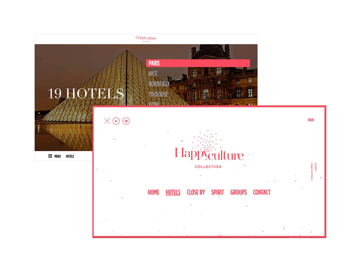
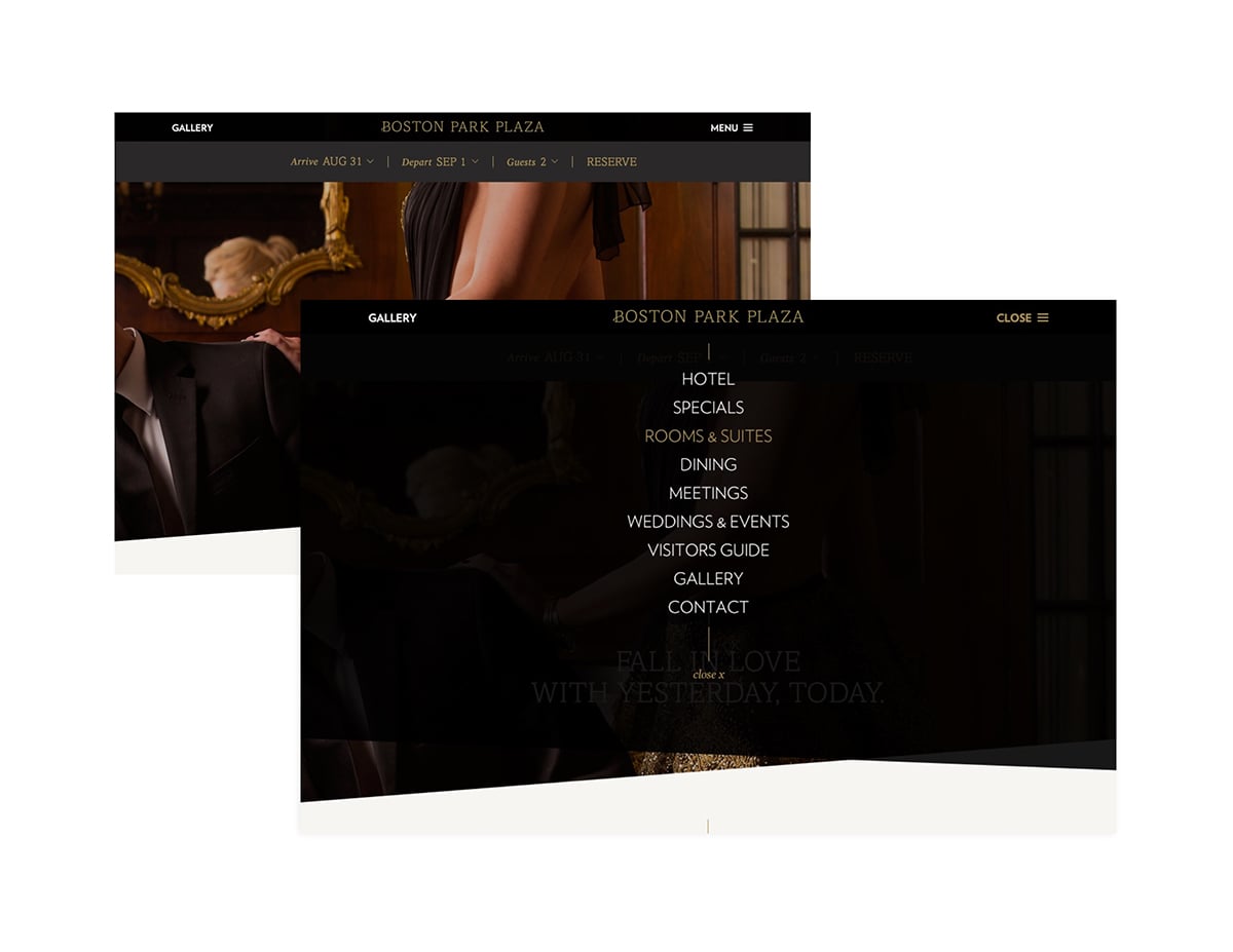
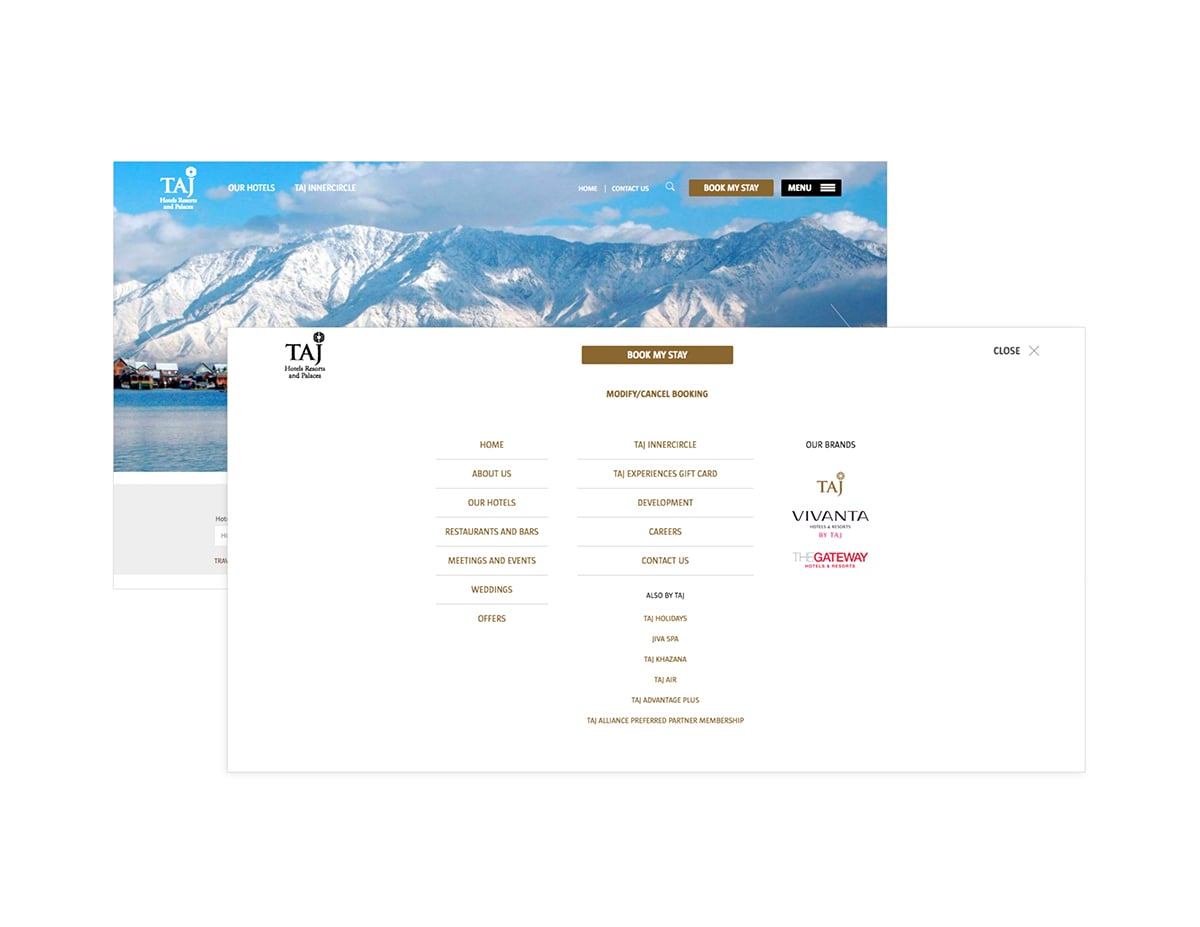
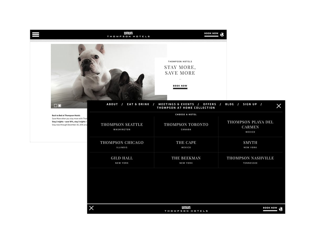
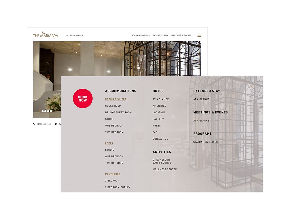
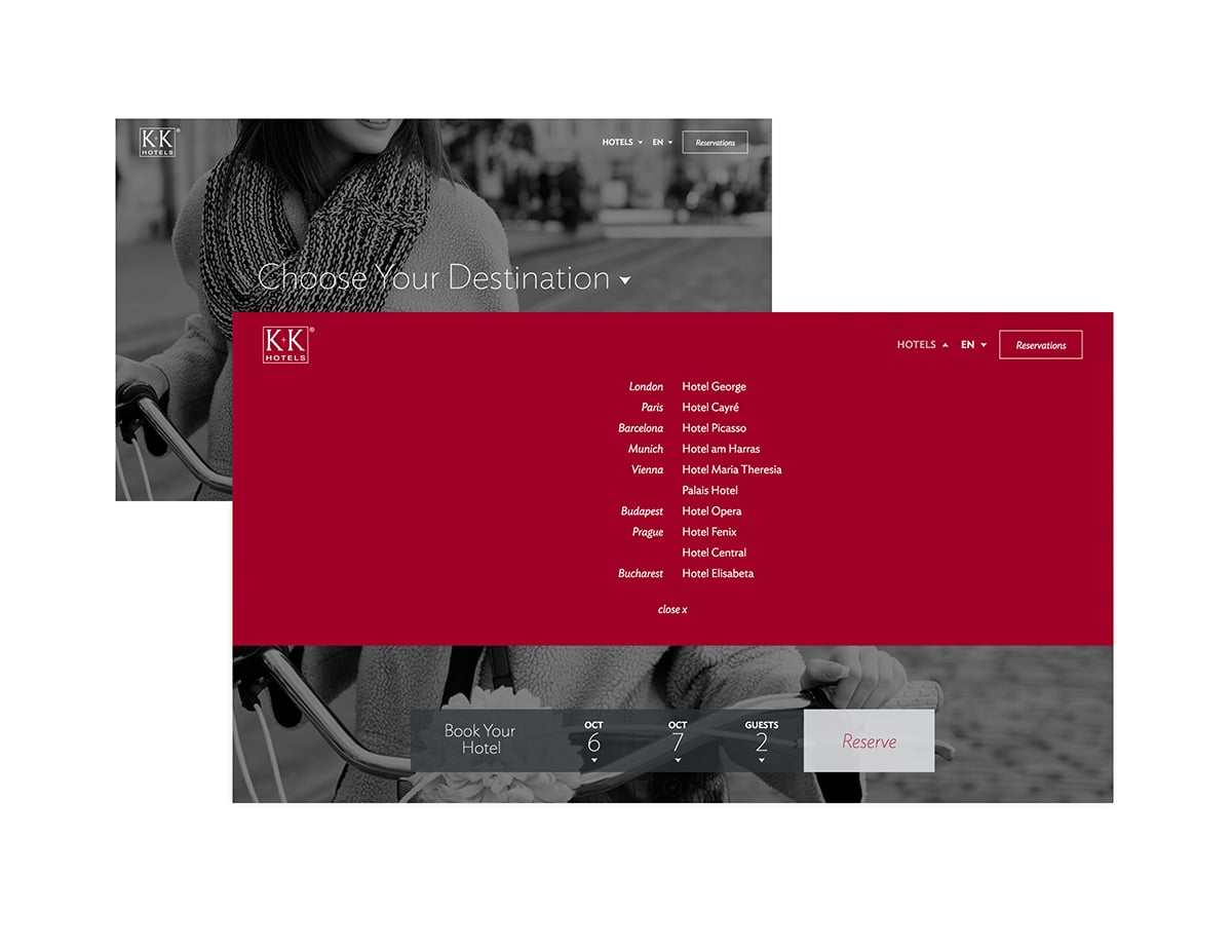
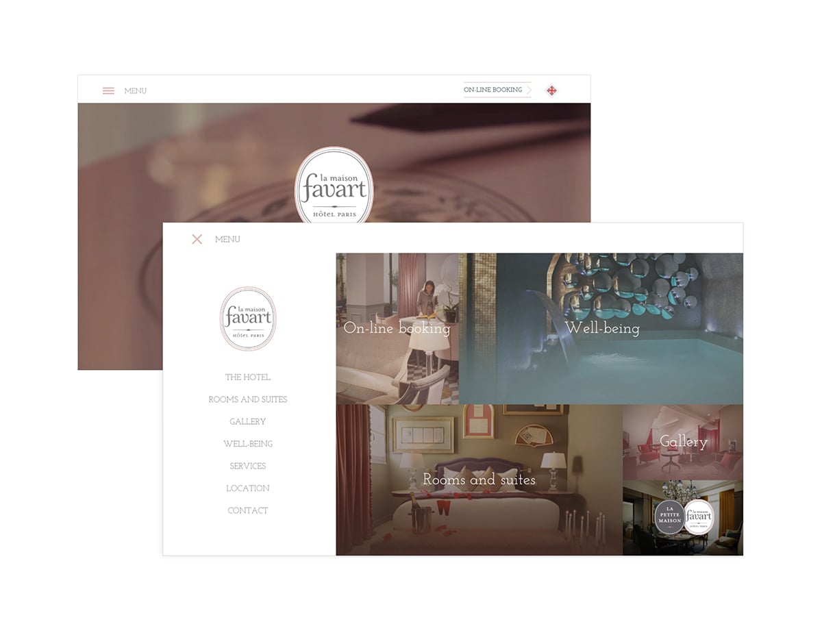
You’ve seen them before; three horizontal lines that have become the standard mobile icon depicting a site’s navigation. When activated, you typically get a beautiful full-screen menu with options galore on your mobile screen. But we’re starting to see more and more of this mobile trend on desktop sites too. And here at team 3FO, we’re in the trenches, fighting for it (most of the time). Here’s why:
full-screen menus
give more real estate for navigation items. No more squeezing top level items into a horizontal nav bar that just won’t fit when someone decides everything in the footer belongs on top too. Even the menu itself is scrollable, easy peasy.
clutter-free homepages
with ten or so less words for the eye to scan, you can bet they’ll see your booking button or the-most-important CTA that much more quickly. In sum we’re pushing the experience AND the message the user will be more focused on.
bigger fonts
work great if you have an older demographic or just want to be more impactful with an easier-to-use navigation menu because now you have the room to make it happen. And a tip for directing the older folks: place the word “Menu” next to the burger.
better UX
allows users to get a similar experience on your website regardless of the device they’re using. That’s big. Like brand building big.
Now, taking all of this with a grain of salt, understand that we’re also fans of “one-less-click saves the day”. Which means we’re not blindly adhering to this trend; so if you have a portfolio site with only three nav items, we say let’s keep it old school and stick with the navigation bar.
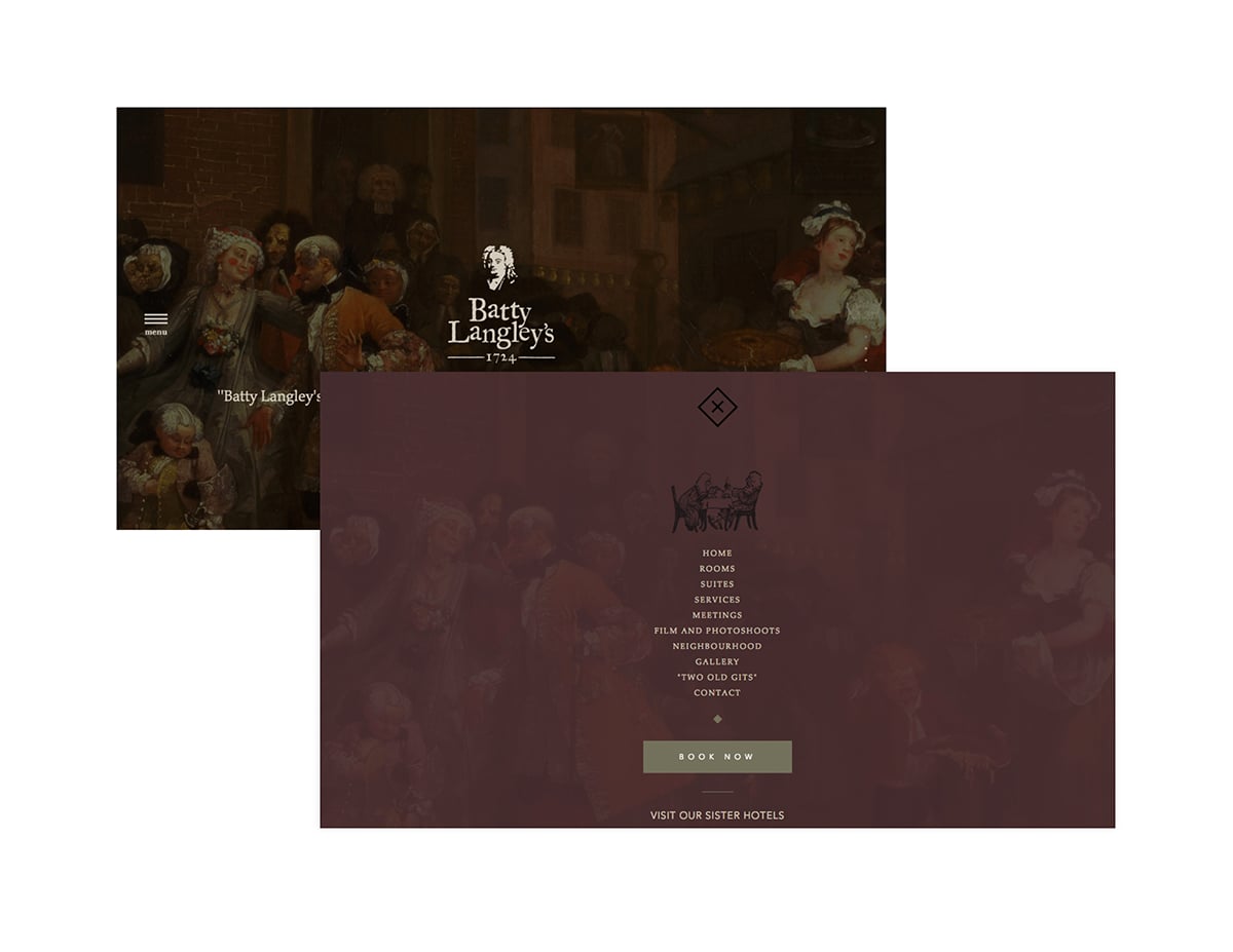
Here are some great examples of the latest hospitality websites where the burger has been introduced into the desktop viewport.
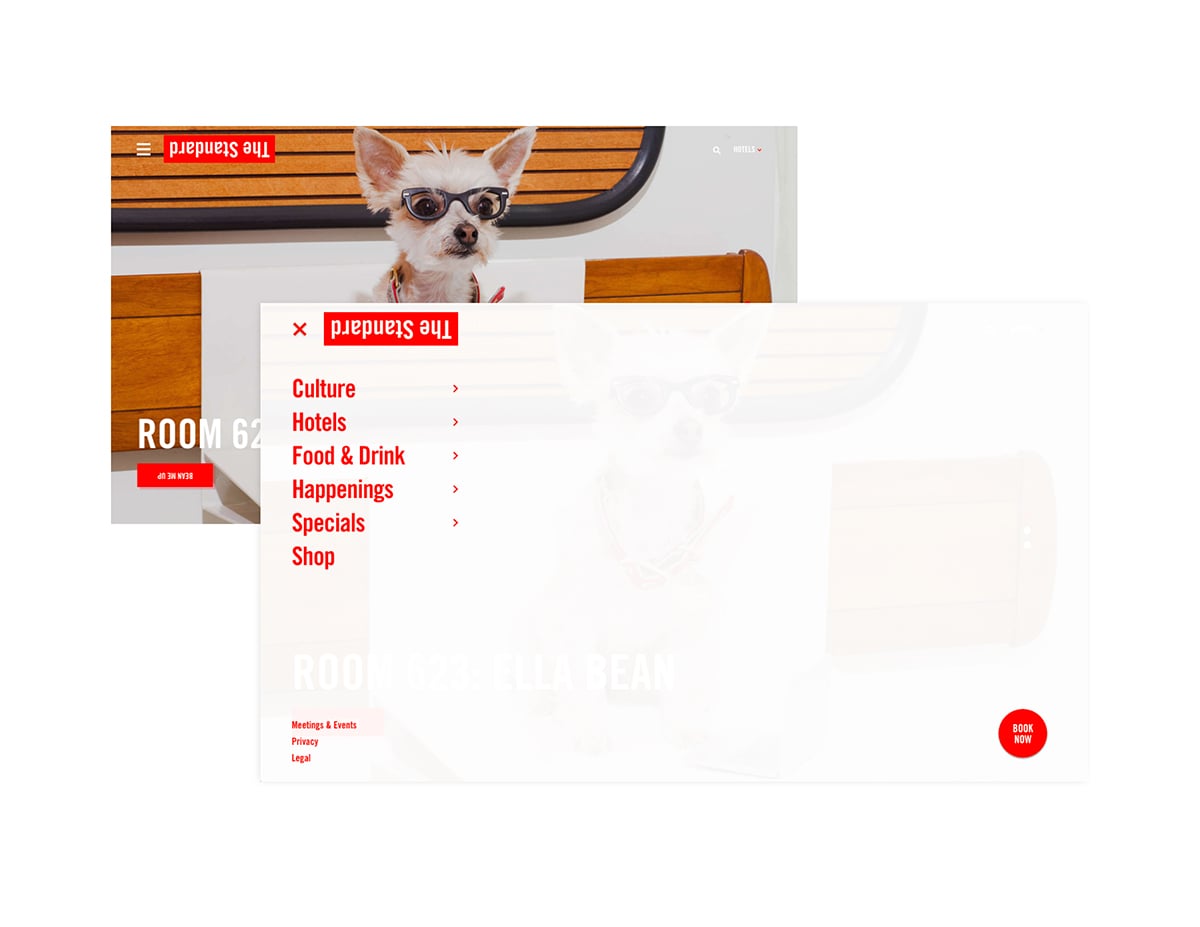
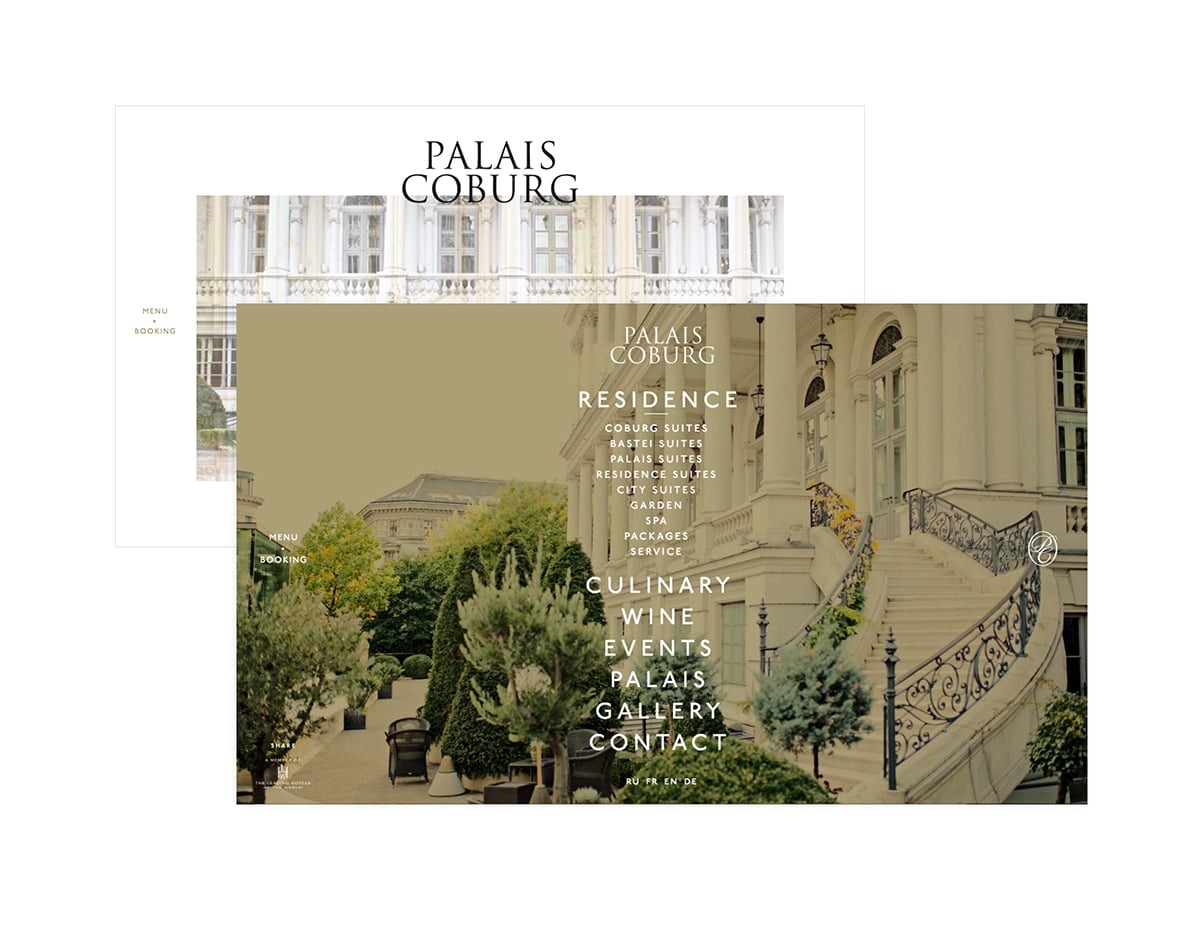
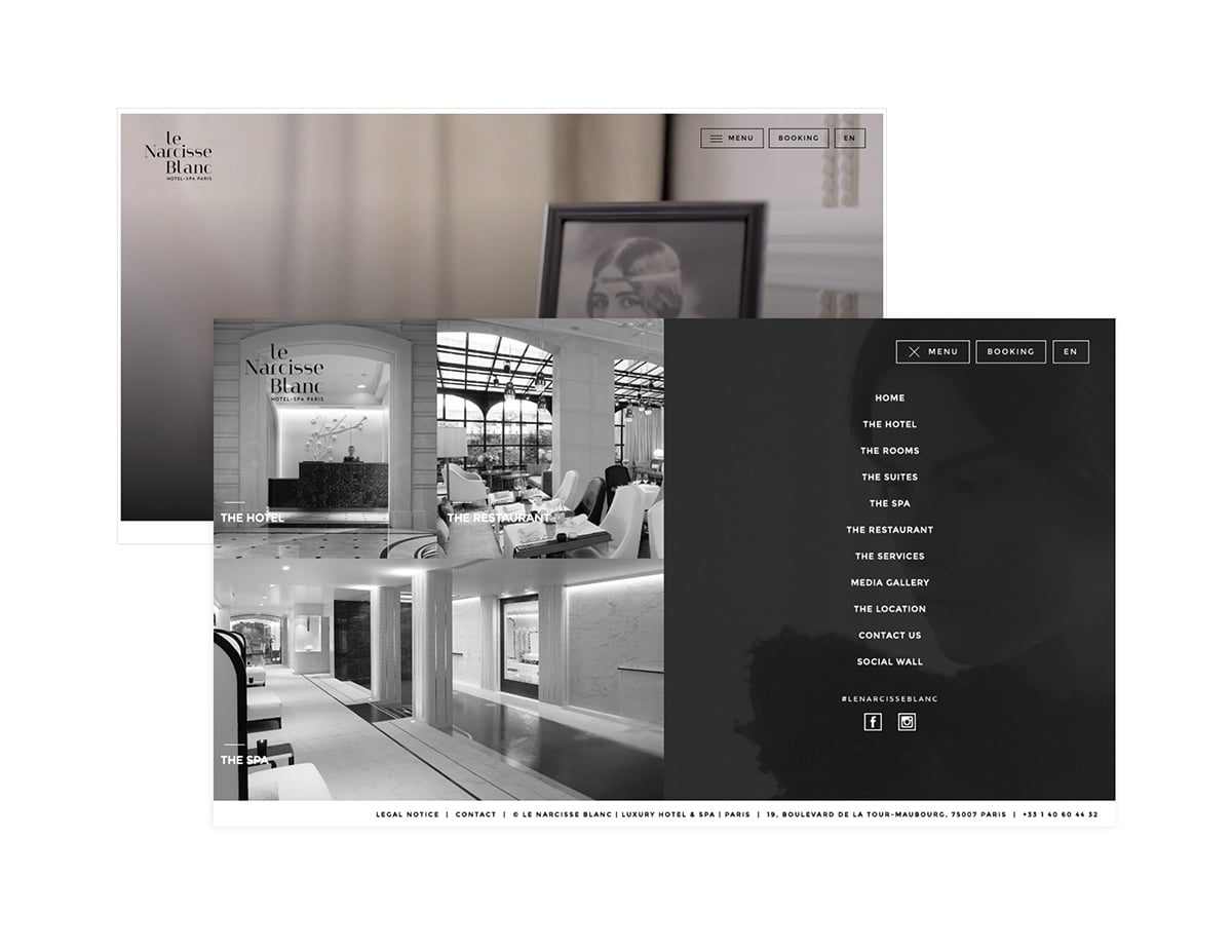
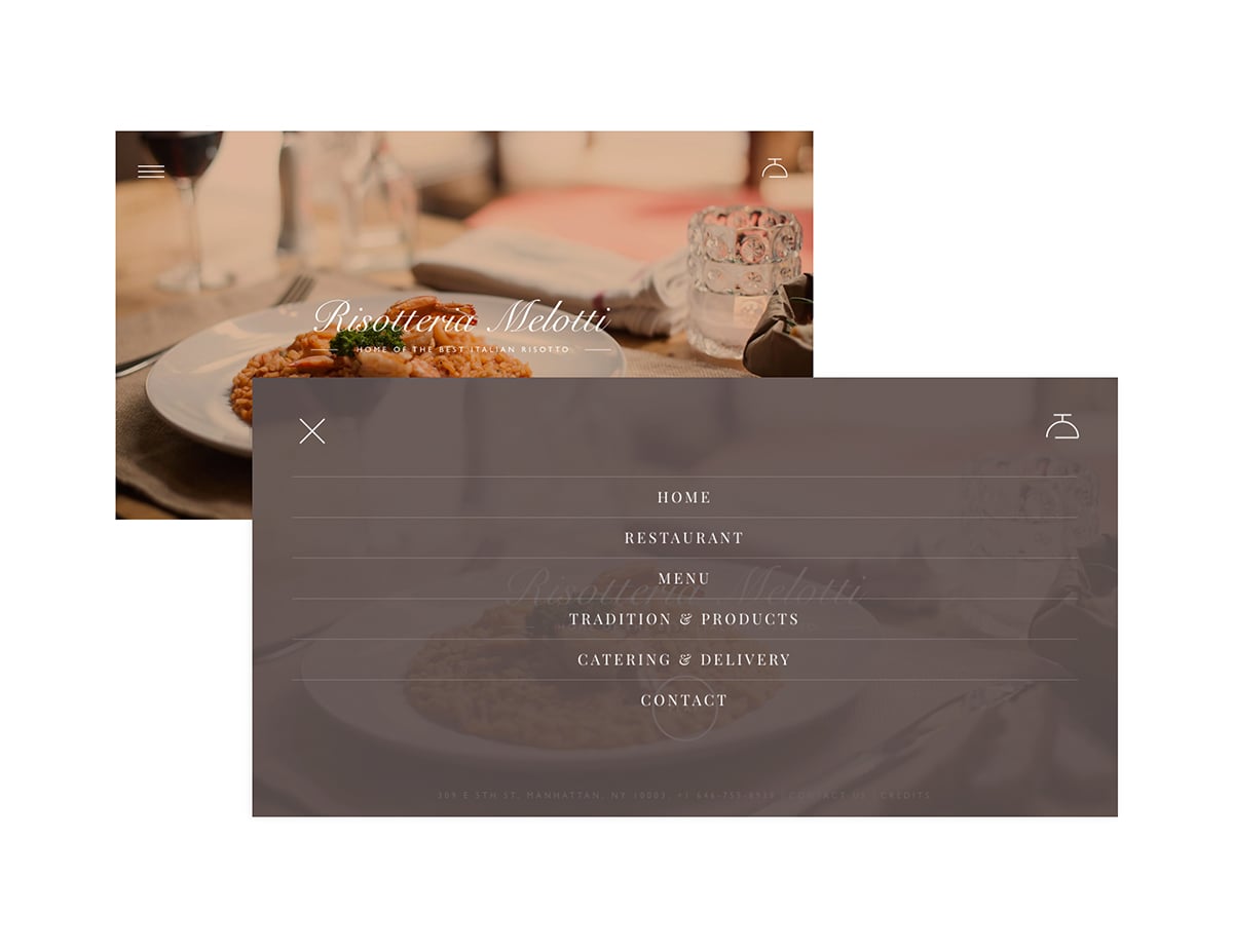
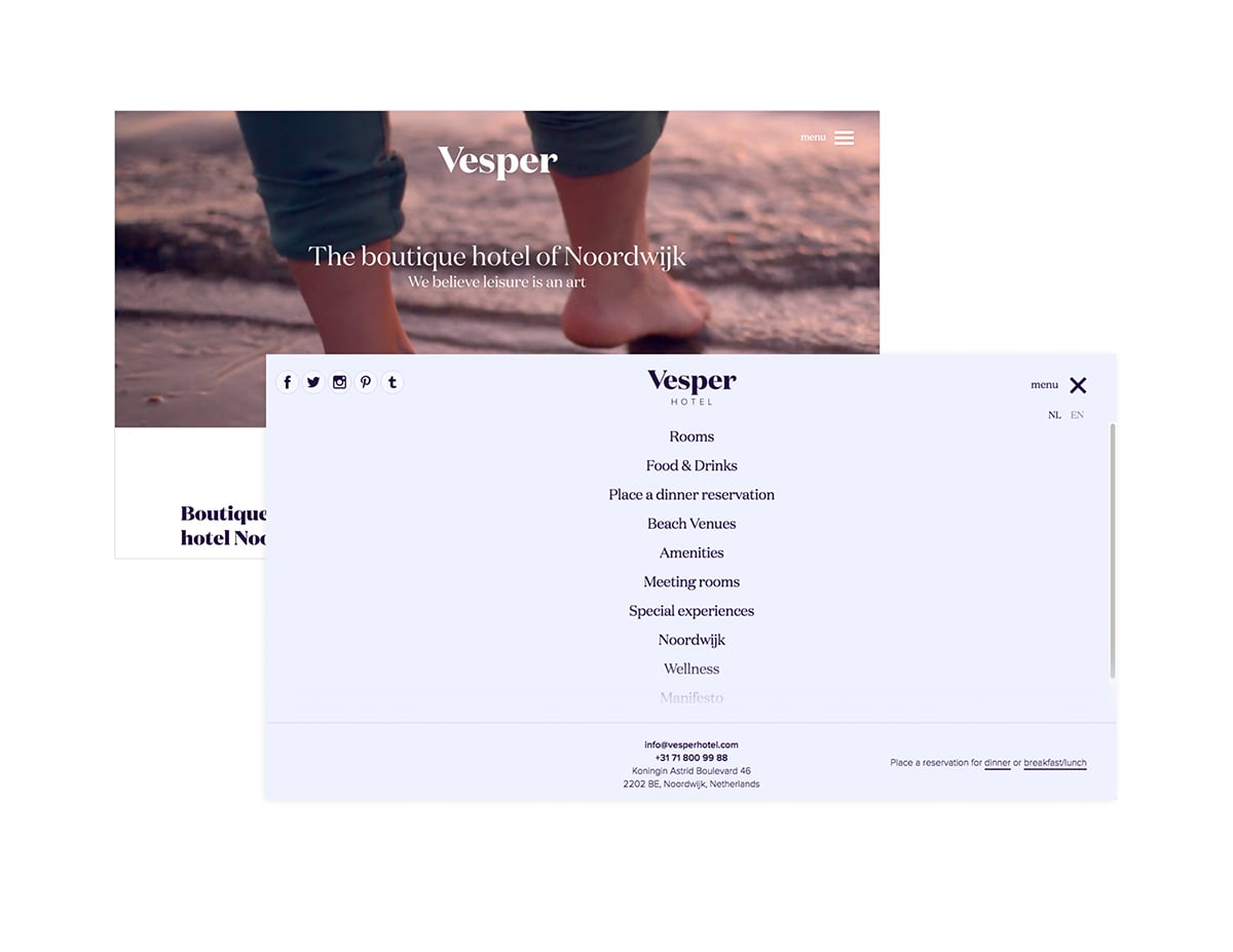
Taj Hotels Resorts and Palaces
“Think of it as the yellow brick road that leads to The Emerald City. All other routes are simply detours.”
Countless studies have shown that when given too many options, most people are likely to choose nothing at all. One particular study found that users are actually ten times less likely to act. So by tucking away the navigation, or even only what you have determined to be secondary navigation items, you are essentially eliminating “decision fatigue” from the equation, and putting your users on the path that you have pre-set for them.
“What path,” you ask? We all know by now that every webpage should have a goal. Whether it is to capture email addresses, generate social shares or actually making a sale, you should have a clear, bold call-to-action (CTA), directing your audience exactly where they need to go. Once you have this goal defined, it can often make sense to point your users in a single direction, toward the CTA. Think of it as the yellow brick road that leads to The Emerald City. All other routes are simply detours.
By keeping the navigation simple, eliminating extraneous options and providing a clear objective, you are pointing your users in the right direction toward making a conversion.
Source: Making a case for the desktop hamburger menu – Usability Geek
“Mobile visitors have learned the meaning of this symbol and websites should embrace it as a standard…”
Although Hamburger Menus sound like a feature best-suited for fast food restaurants, they are quickly becoming a must-have for companies that do a lot of business on mobile devices. You’ve seen them before: Hamburger Menus have become the standard mobile icon for mobile navigation and menus.
They feature three horizontal lines that, when pressed, offer a drop-down menu of a website’s navigation. They are particularly useful on mobile devices where screen real estate is at a premium. But we’re starting to see them on desktop websites as well, so consumers have a similar experience on company websites regardless of the device they’re using.
“A lot of people see Hamburger Menus and they know what it means, but they don’t know it’s basically the new standard,” Rodriguez said. “Mobile visitors have learned the meaning of this symbol and websites should embrace it as a standard for navigation.”
Source: 9 tips for designing a great web storefront – B2C
More
insights
©2025 300FeetOut All Rights Reserved | Privacy Policy