is bigger better?

Written by
Greg Ciro Tornincasa
Read time
2 minutes
Category
hospitality booking widget trends: a competitive analysis by 300FeetOut
The age old question you seem to be asked just as often as hearing the words “scalable”, “ROI”, and “optimization”. While tiny homes are all the rage and micro units are the next big little thing, the online booking experience seems to be getting bigger. And yes, it’s better.
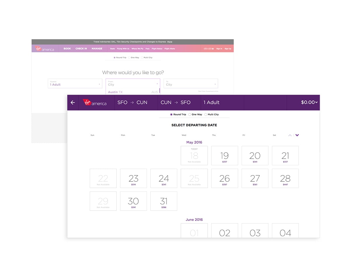
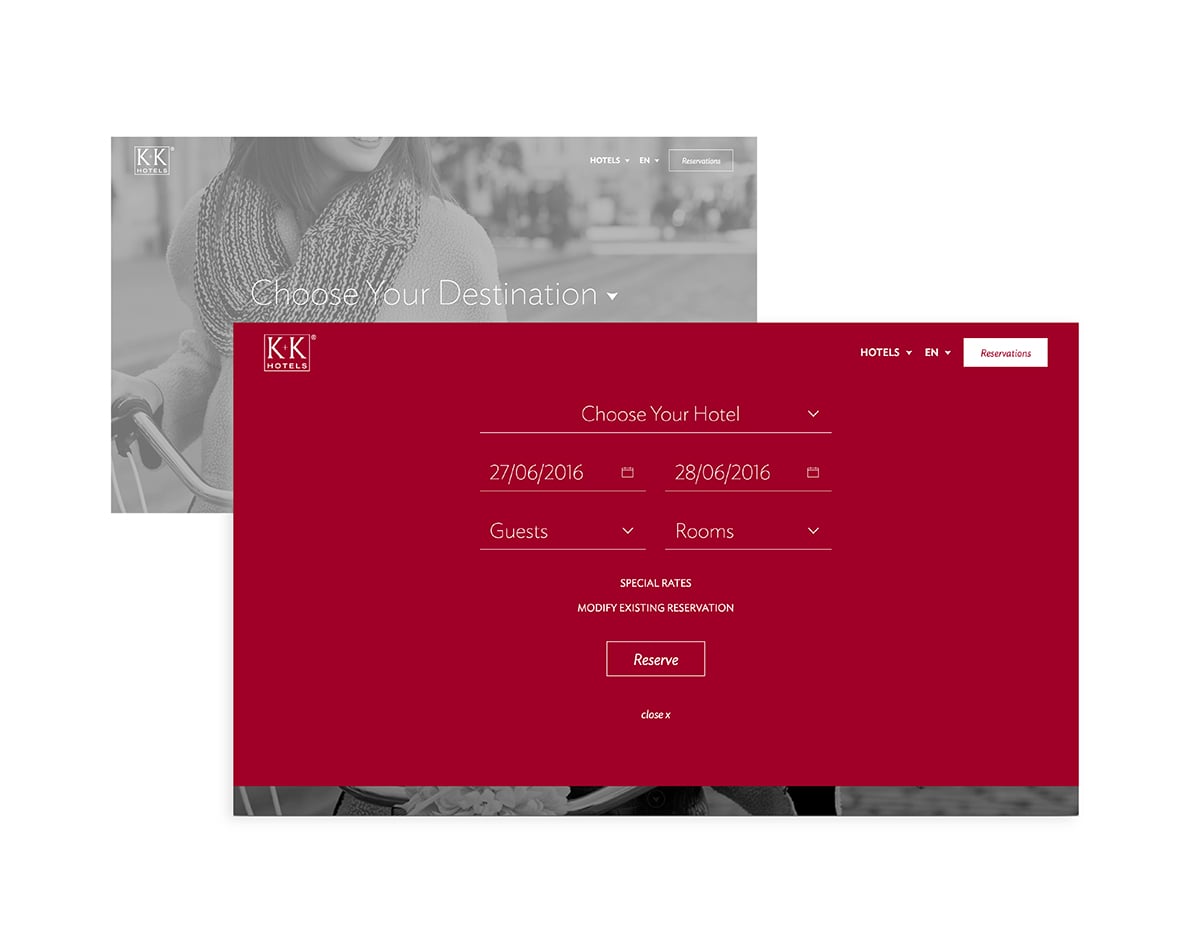
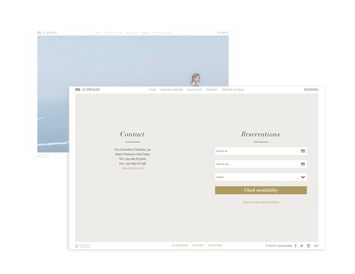
Try booking a hotel today and more often than not you’re forced to use a tiny booking widget, crammed onto the page with poorly designed default drop downs, and tiny popup calendars surrounded by many distractions. If your hotel’s website is supposed to be an experiential extension of your property — shouldn’t the booking experience be just as thoughtful as your concierge? The hospitality sites that are pushing the envelope understand this. We’re seeing many more booking widgets going full-screen, becoming easier to use, and design playing a larger role in the UX. Here’s the change we’re seeing:
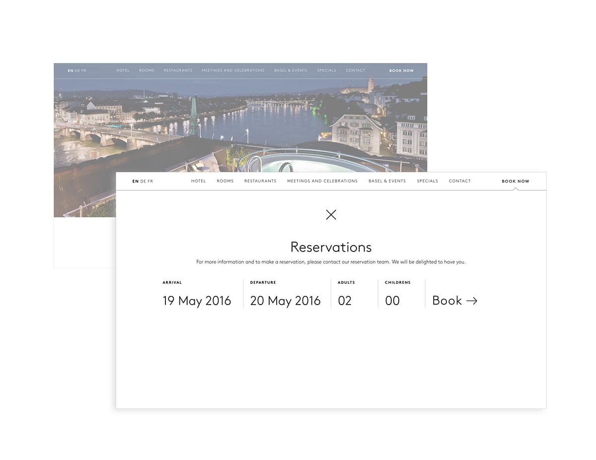
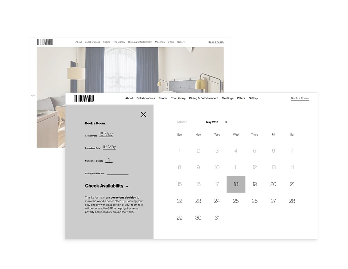
full-screen booking
more real estate, less squinting.
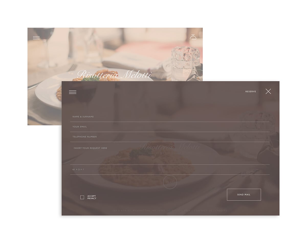
improved UX
a faster, user-friendly experience across devices.
less fields
perfecting each step throughout the booking process.
big calendars
big fonts, big boxes, big buttons — loved by big thumbs.
zero distractions
you’re done being enticed by rotating hero images or running video — it’s time to book.
joie de vivre Hotels & Resorts
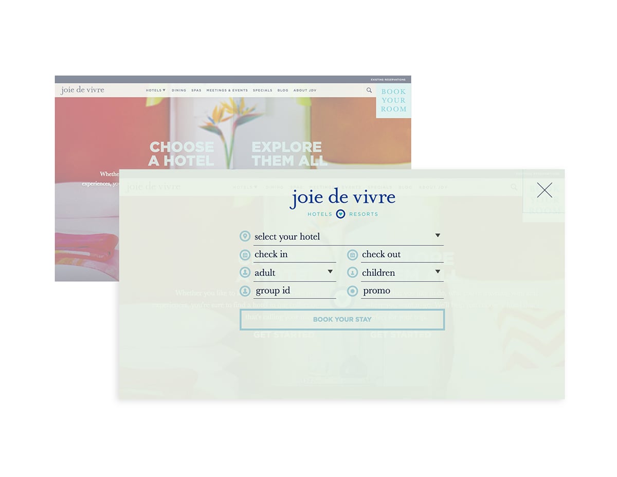
“forms and inputs go full-screen”
More sites and apps are going with the full-screen forms and input screens (such as signups and logins) instead of it existing in only one small part of the site. This trend comes from responsive design best practices for several reasons: keeps another screen from being loaded, gives more screen space for easier touch by fingers on touch screens, and encourages users to complete the form (for those forms that present one input at a time).
Source: 10 Web design trends you can expect to see in 2016 – The Next Web
More
insights
Lorem ipsum dolor sit amet, consetetur sadipscing elitr, sed diam nonumy eirmod tempor.
©2025 300FeetOut All Rights Reserved | Privacy Policy