one typeface, many logos
Mia Pinzelik
2 minutes
In our world, we are surrounded by thousands of brands and logos on the regular. From the grocery store to the websites we visit, brands are everywhere and showcase a wide variety of styles and typefaces. While you may not notice it immediately, many logos share the same typeface even when selling very different products to different audiences. Let’s take a look at the typeface Avante Garde Gothic (the primary typeface used here at 300FeetOut) and see how different brands use the same typeface in lots of different ways.
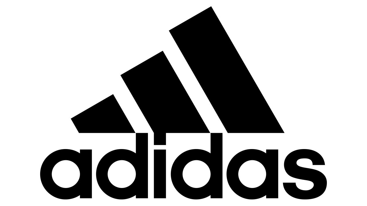
Adidas
First up, Avante Garde Gothic gets the coveted spot of sports apparel with the adidas logo. In the 1920s, the logo featured a bird carrying a pair of shoes and it wasn’t until 1949 when the iconic typeface was introduced. The logo we know and love today was further finalized in 1971.
Calvin Klein
The iconic underwear and apparel brand uses a simple, clean, type-focused brand mark also based on a thinner weight of Avante Garde Gothic. The mark has not changed much since its original conception in 1968 with the exception of the “CK” emblem used since the 1990s.
Nutella
Moving away from clothing, we have everyone’s favorite chocolatey spread. The logo we know and love was introduced in 1964, along with the name change to Nutella from “Supercrema.” Slight changes were made to the logo in 1970, but the look and feel remained the same and still does today.
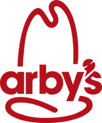
Arby’s
Avante Garde Gothic appears in Arby’s brand mark for only one year in 2012, accompanied with the new slogan “slicing up freshness.” The logo’s iconic hat-shaped abstraction was derived from the original logo of a hat with the text “Arby’s Roast Beef Sandwich is Delicious.”
More
insights
©2026 300FeetOut All Rights Reserved | Privacy Policy