playful type at the
new sfmoma

Greg Ciro Tornincasa
1 minute
Three years ago we said “see ya later” to the SFMOMA. No more rooftop Blue Bottle Coffee with a side of Mondrian inspired cake, no more competitions over who’s instagram post was the most abstract, and no more lunchtime inspiration outings for our design team. Sad emoji face 😢.
The SFMOMA ‘On The Go’ off-site programming and relocated museum store tucked between Tropisueño and the Contemporary Jewish Museum did keep our appetites whet. But we were HUNGRY!
The museum, at 3rd and Howard streets since 1995, finally reopened in mid-May after the three-year, $305-million renovation and expansion. This past week, our design team rushed over to get our long awaited fix. Yes, the Snøhetta expansion is breathtaking. Yes, the 170,000 sq ft of exhibition space is amazing. And yes, Sightglass Coffee after lunch on the rooftop was awesome. But what really jump started our appetites after all this time away? The white walls.
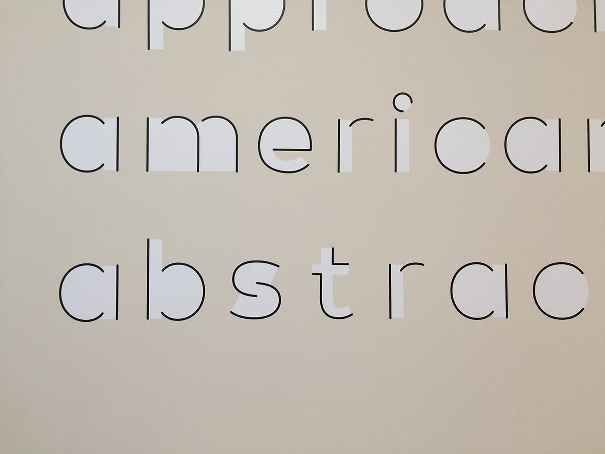
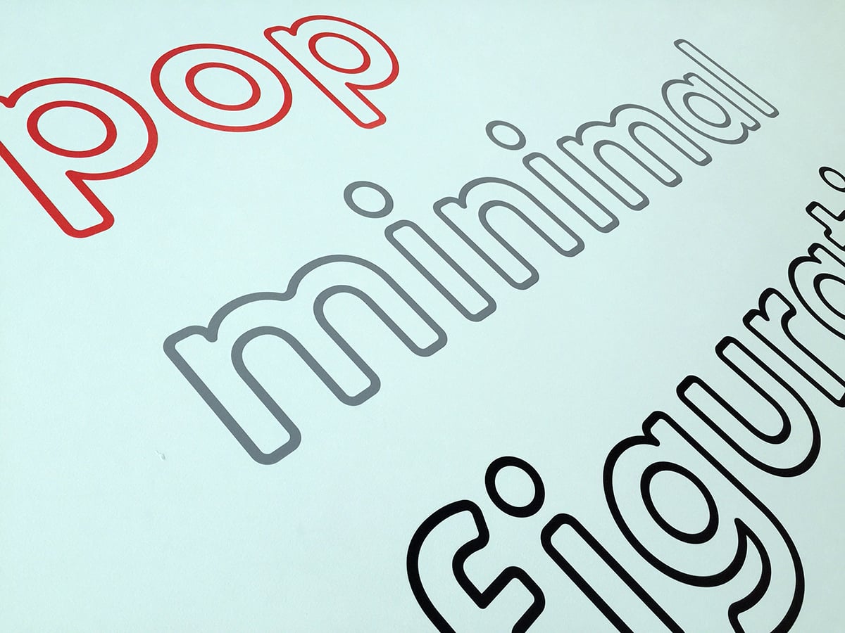
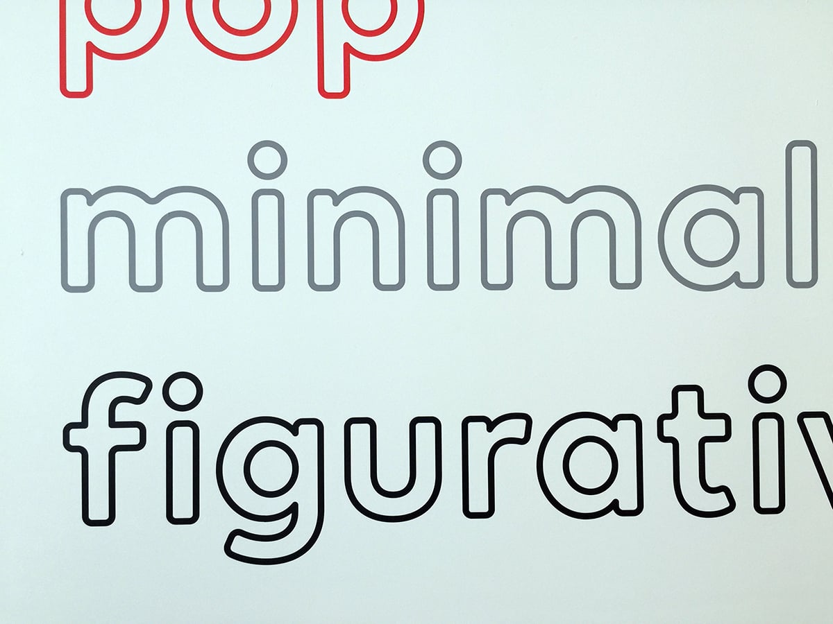
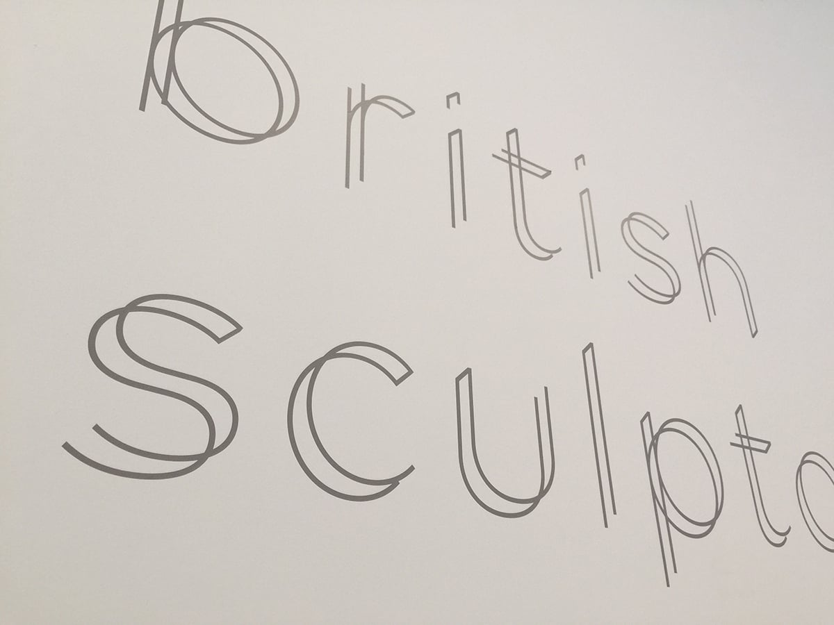
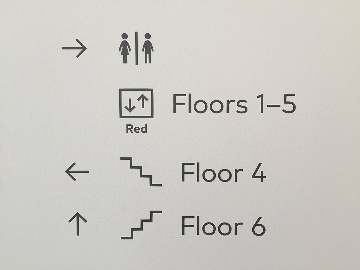
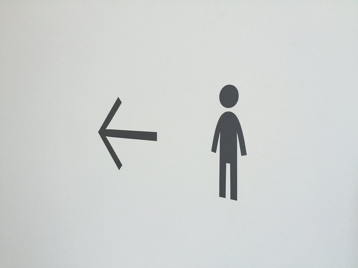
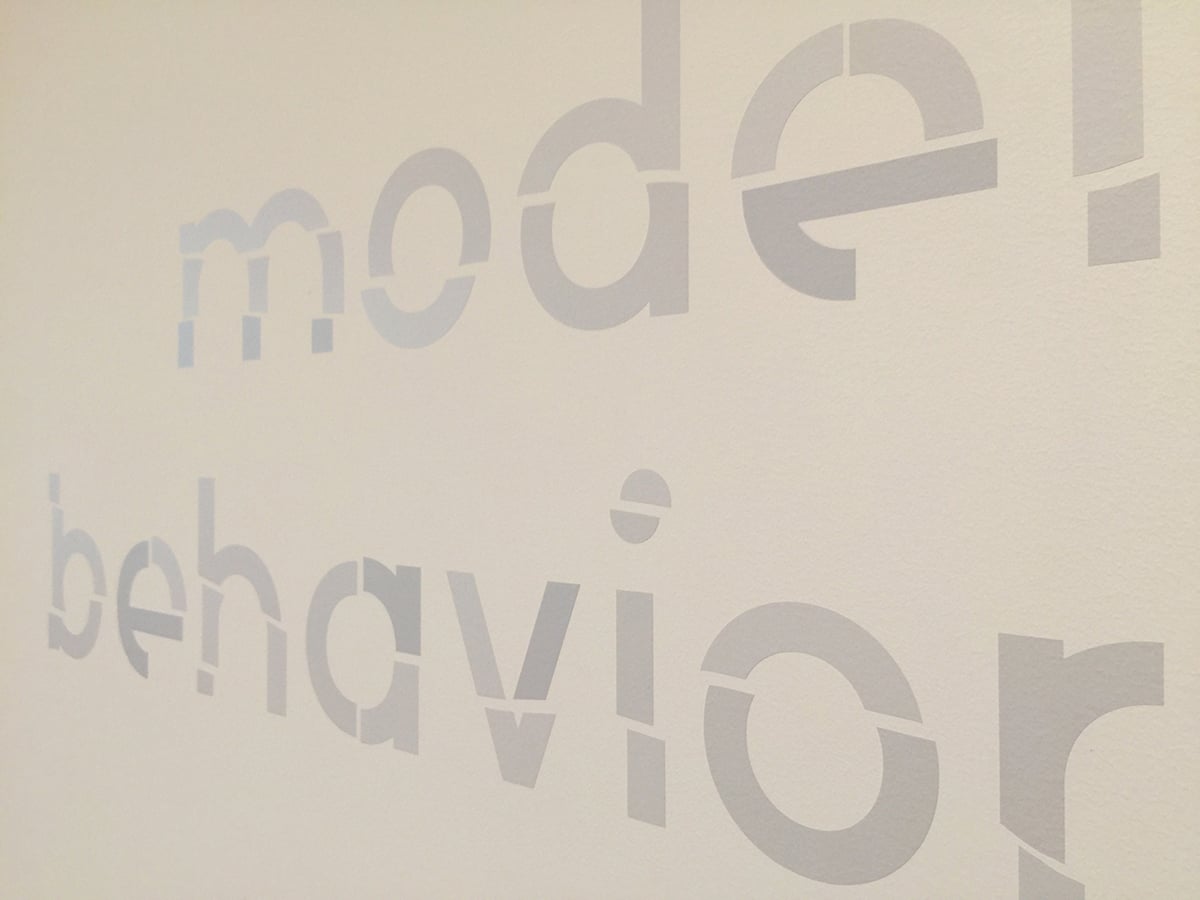
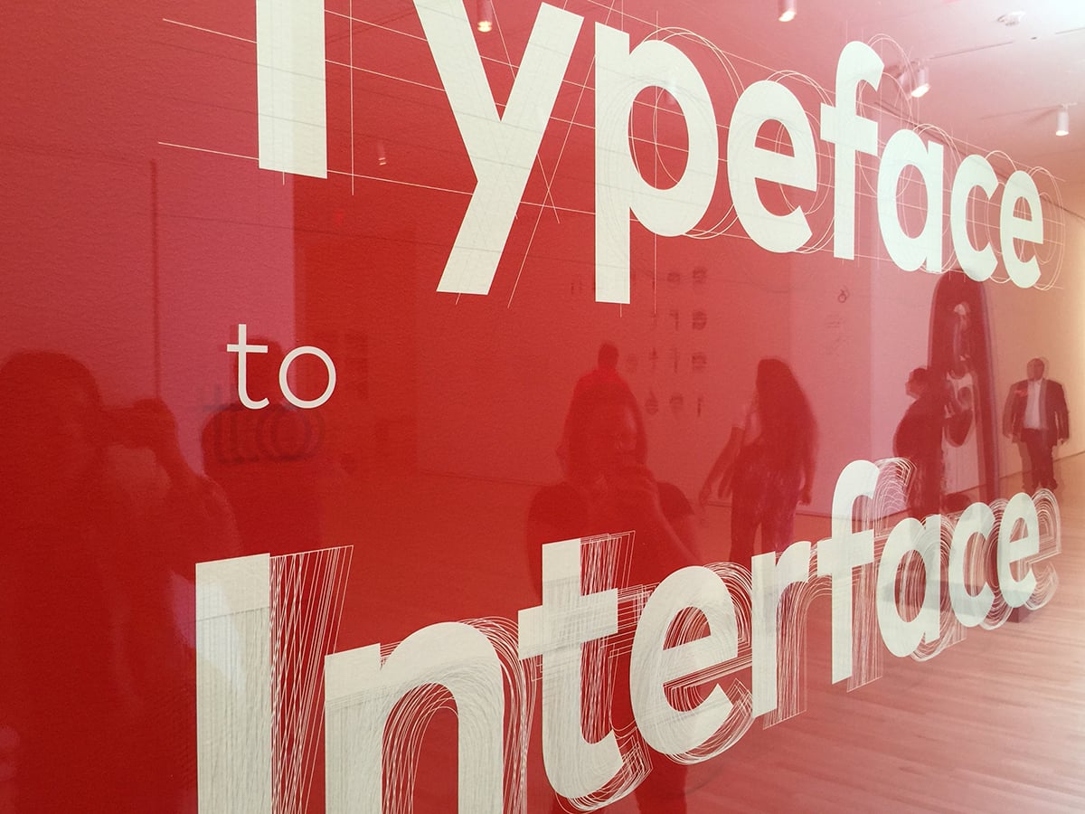
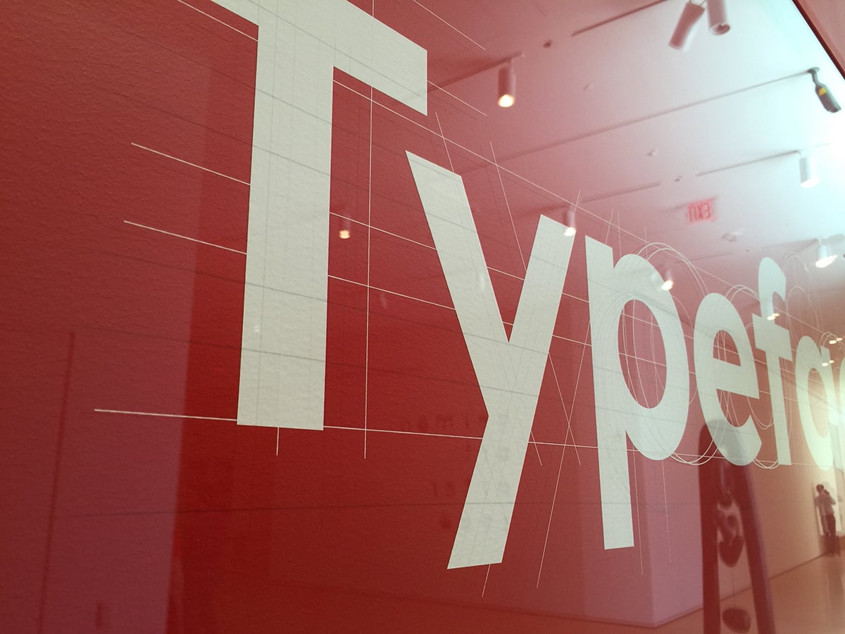
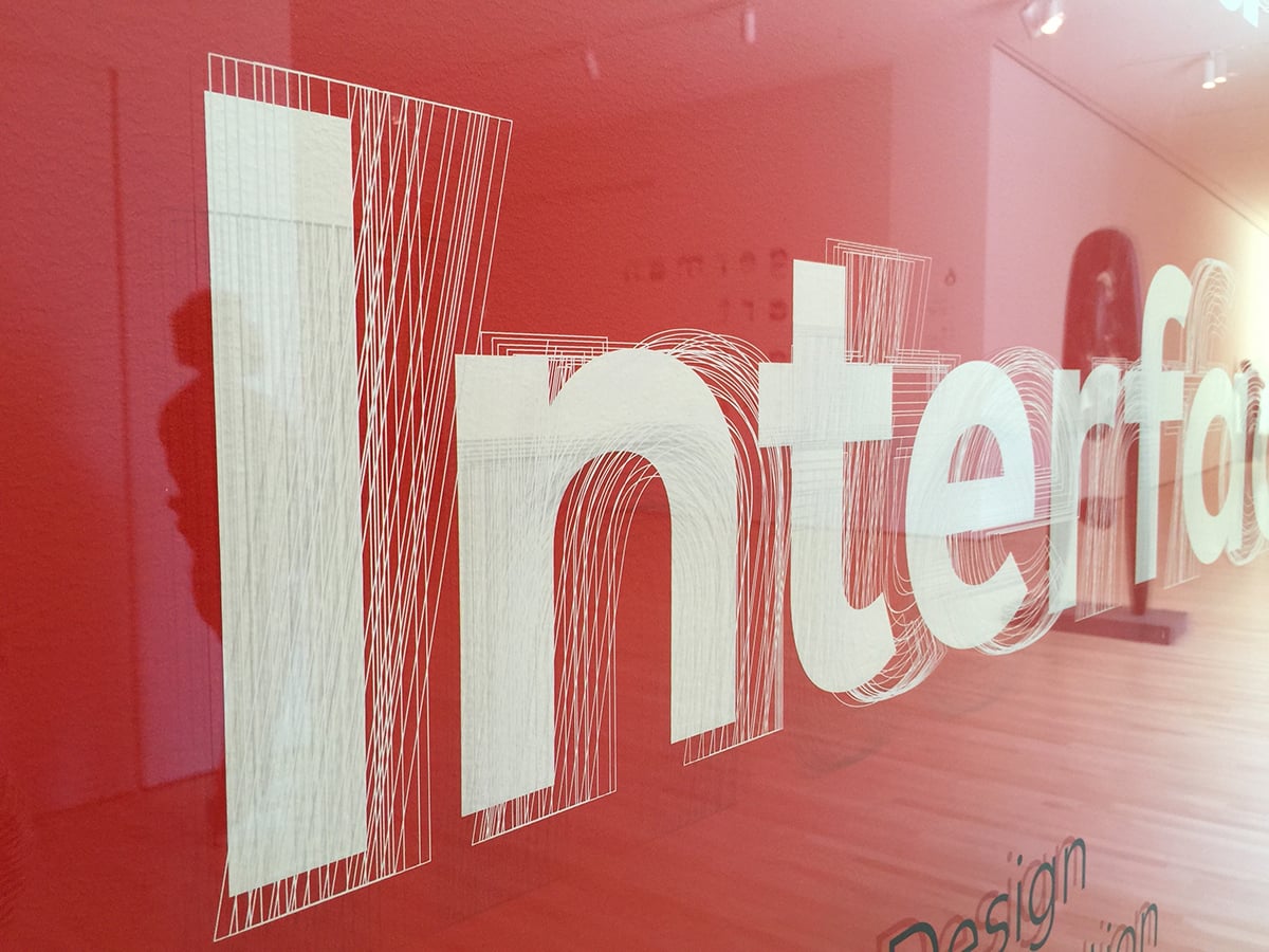
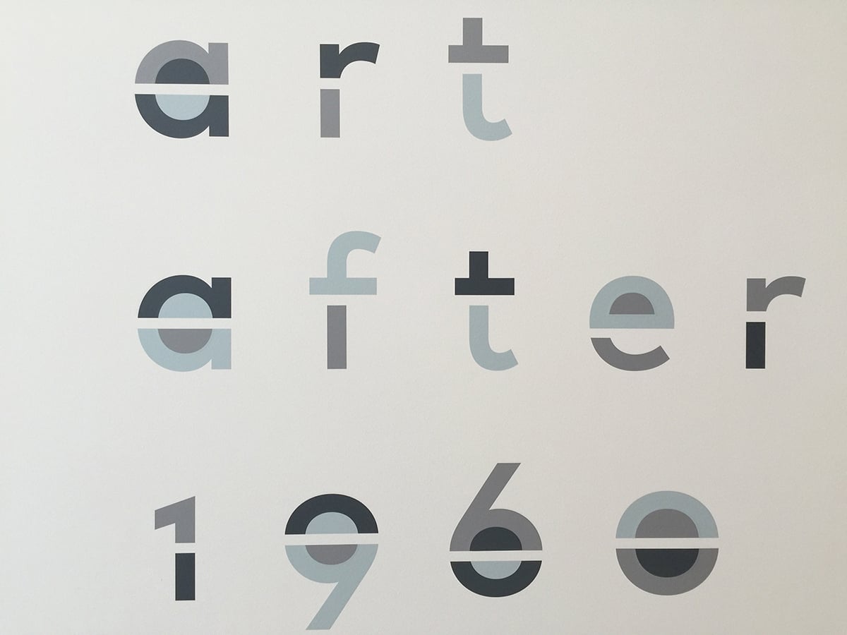
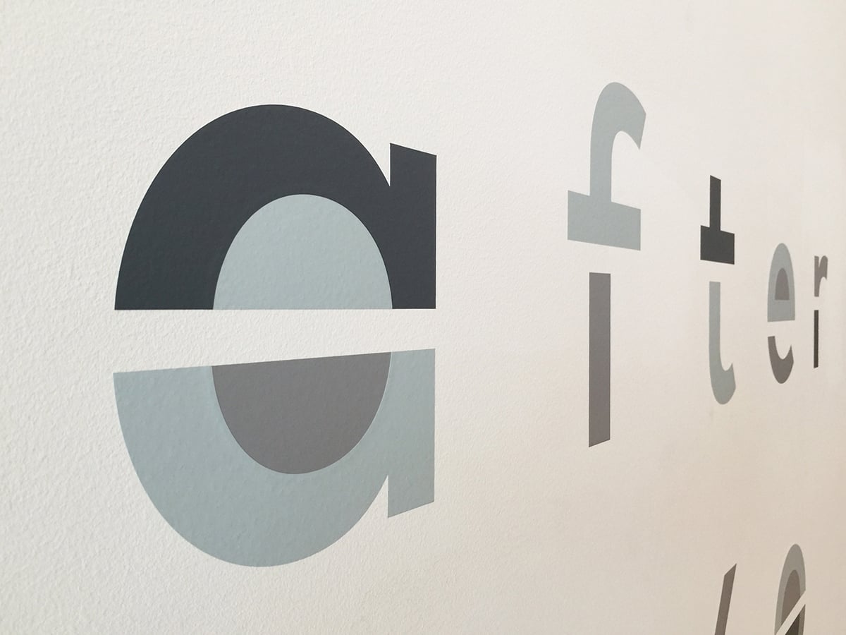
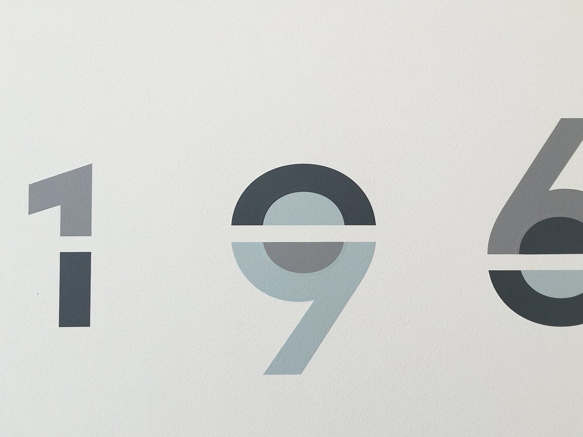
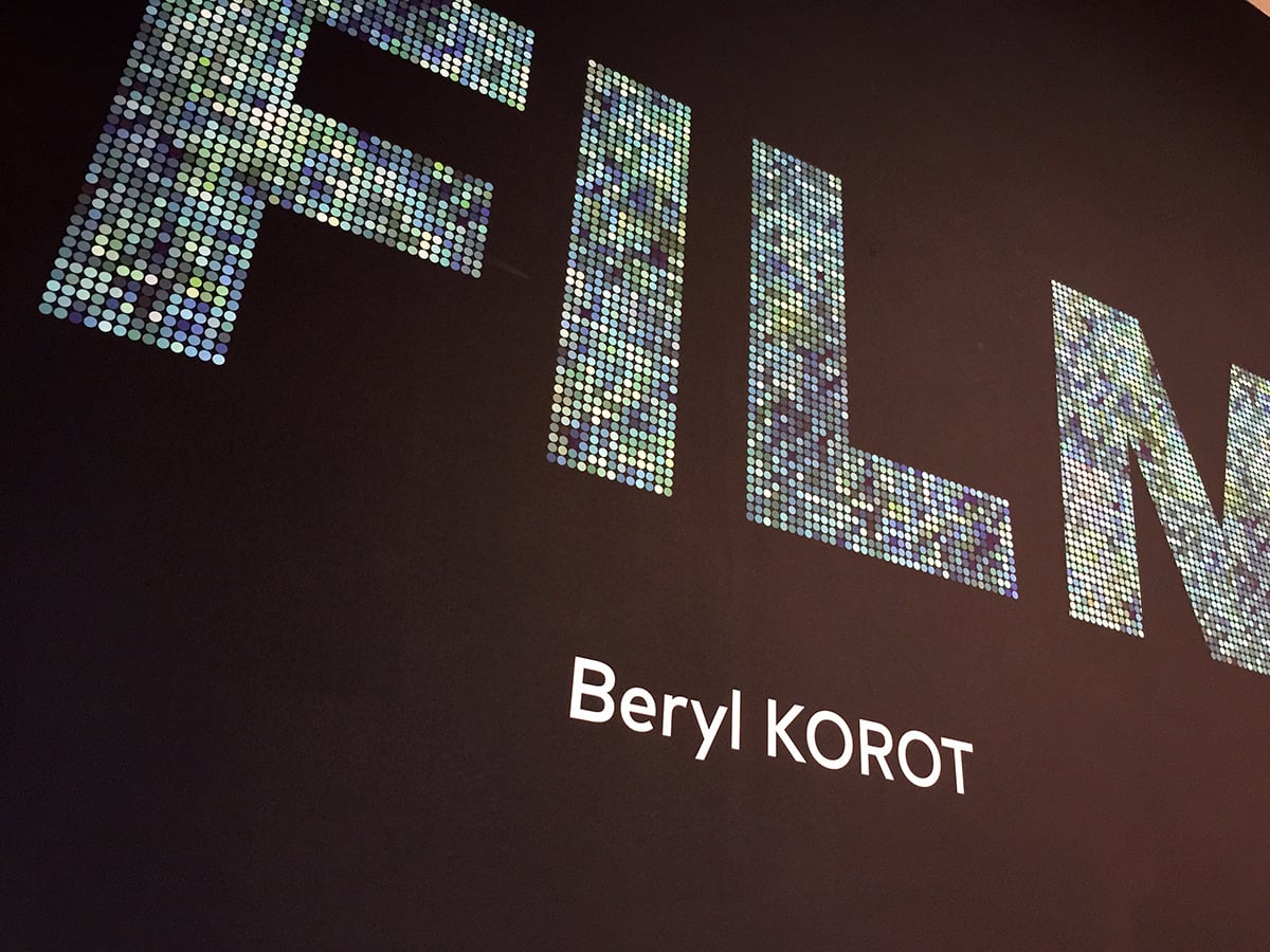
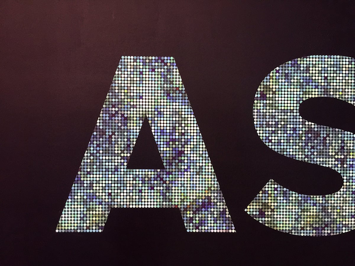
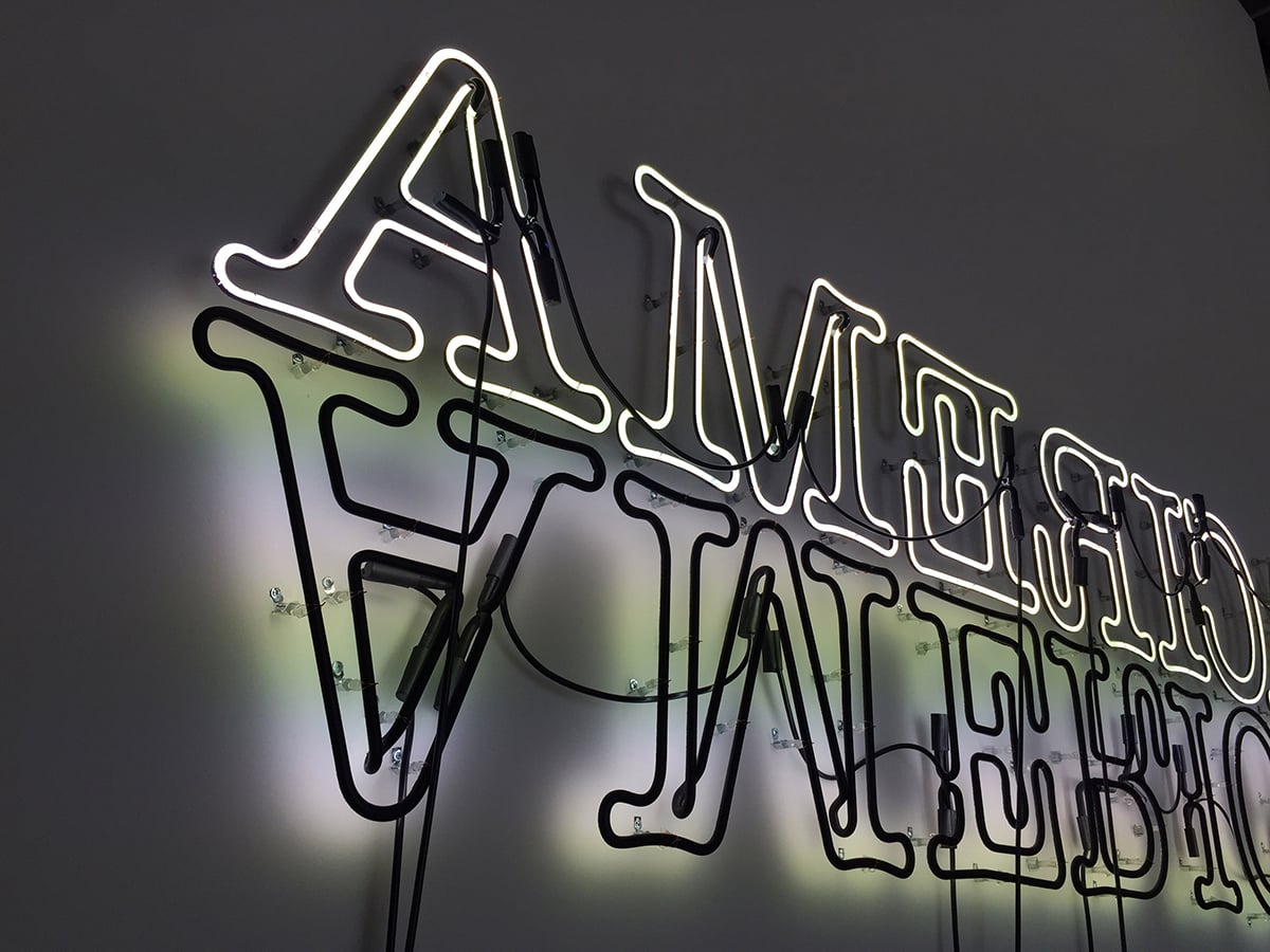
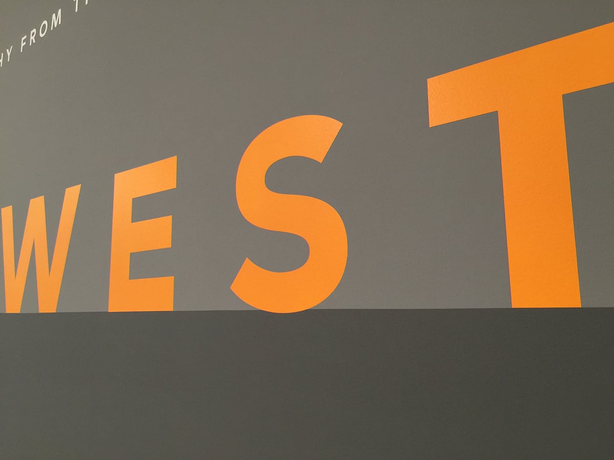
Exploring the space, we were most impressed with how the team at SFMOMA introduced the galleries with fun, expressive, and often playful typography. We’ve always loved the clean helvetica-ish type rubdowns on those crisp white walls. But this typography knocked boring aside and had us graphic designers geeking out. This is really what we missed. Being in inspired. Hallelujah emoji hands 🙌.


More
insights
©2025 300FeetOut All Rights Reserved | Privacy Policy