Why Design Systems Matter
Written by

Read time
6 minutes
Category
Why We Built a Design System (And Why You Should Too)
It’s no surprise we’ve been producing brand assets for businesses for over 25 years — we know how to optimize. Images, websites, our time, and our processes. But as our team grew and our capabilities expanded, we found our collaboration bottlenecked by outdated tools and workflows.
One of our team’s greatest strengths has always been our ability to collaborate effectively as designers and developers. We already speak each other's language, but we needed a process to support that at scale. A design system was the answer.
What is a Design System?
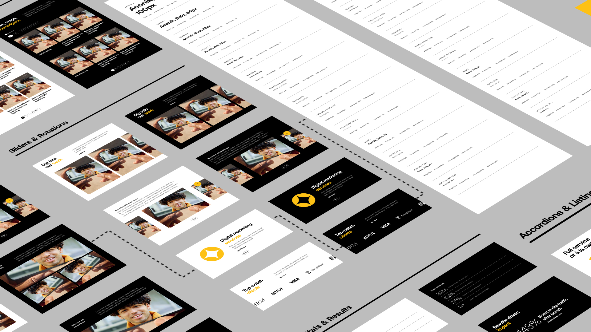
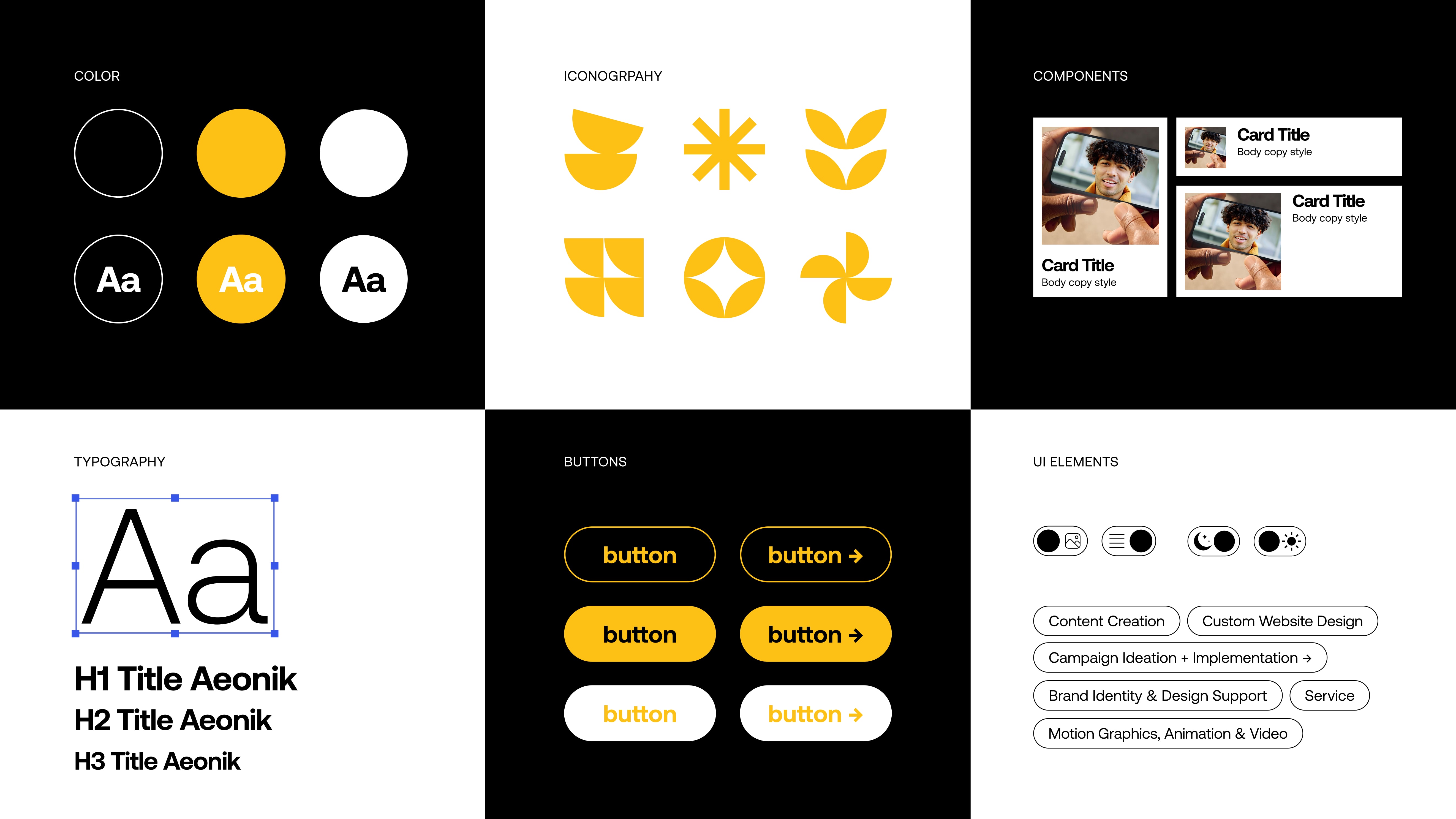
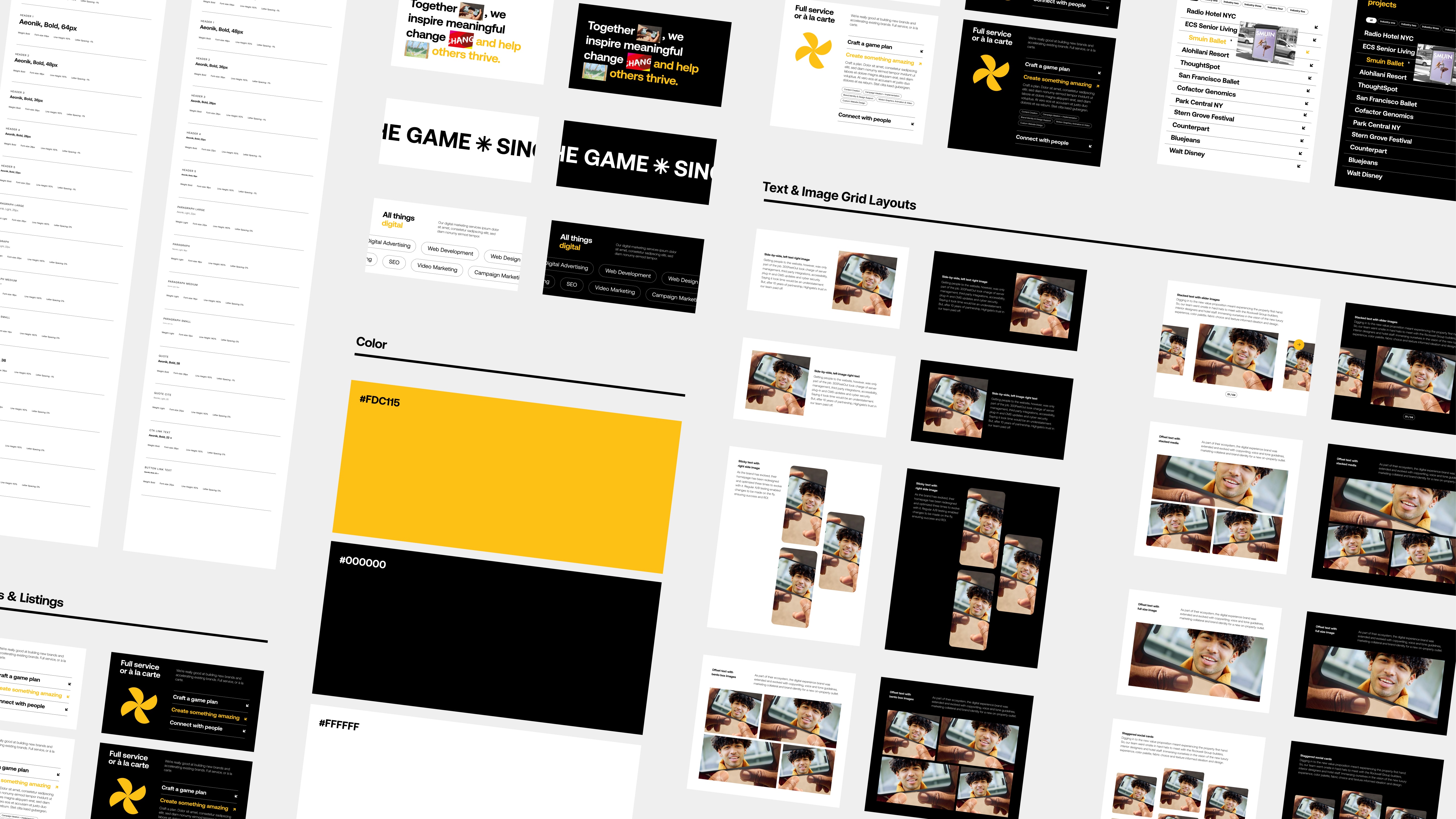
A design system is a comprehensive, living ecosystem that bridges the gap between design and development. Design systems are made up of design tokens (think hex codes, font sizes, etc.), visual UI elements, and a version-controlled, production-ready component library.
1. Increase Productivity
Way back when our team was small, we didn’t need a blueprint — we relied on tribal knowledge, and, quite frankly, lots and lots of QA. We’ll always QA, but relying on memory to maintain consistency across hundreds of brand assets became an impossible bottleneck. Our design system replaces that fragile tribal knowledge with a codified single source of truth. It takes our collective knowledge and turns it into a solid, shared foundation. We don't have to constantly translate ideas between design and development anymore. By removing that friction, we drastically speed up our workflow and keep our team focused on big-picture innovation rather than sweating the small stuff.
2. Maintain Consistency
We wanted to save our team’s mental energy for solving complex user problems, not rebuilding the same UI element for the fifth time. By centralizing our UI patterns, we’re able to maintain consistency across all of our design assets and ensure components function predictably, no matter where they live in a product. This effectively eliminates "UI debt" — the fragmented, mismatched interfaces that naturally pile up across different client projects as a company scales. But consistency isn't just about how things look; it's about how they are used. By centralizing our UI, we get to bake accessibility (a11y) directly into the foundation of our work. Rather than treating screen-reader compatibility, proper color contrast, or touch-target sizes as an end-of-project checklist, we build them right into our base "atoms” — down to the semantic HTML tags. When a developer pulls a component from the system, inclusive design is already the automatic default.
3. Increase Collaboration
To support this new system, we had to upgrade our tooling to close the gap between how a designer thinks and how a developer builds. By moving to modern, cloud-based tools (like Figma), we aren't just drawing static pictures anymore; we are designing with logic that mirrors code. On the engineering side, we completely re-architected our theme build to be strictly component-based. Instead of writing custom CSS from scratch for every new layout, our developers now pull directly from a centralized component library. Furthermore, by using design variables and Tailwind, we map our visual tokens — like typography scales and color palettes — directly to our development themes. If we update a brand color in the design file, it translates seamlessly to the codebase. This creates a direct pipeline from canvas to code, eliminating the traditional handoff friction entirely.
Growth shouldn't come at the cost of the culture that got us here in the first place. Implementing a design system isn't about restricting our creativity with rigid rules; it’s about creating a solid foundation so we can innovate faster. It’s the tool we needed to protect our key strength, ensuring that no matter how many clients we take on or how large our team grows, design and development will always feel like they're sitting shoulder-to-shoulder.
More
insights
©2026 300FeetOut All Rights Reserved | Privacy Policy