admin panels: accommodating the new gutenberg editor

Chantel Keith
3 minutes
With the release of WordPress’ newest editor, Gutenberg, WordPress web developers, web producers, and web designers alike were challenged with rethinking their content management process in order to integrate this very powerful visual editing tool into their workflow. Although we have discussed best practices for designing administrative panels in our previous series, the landscape has been greatly improved with the addition of Gutenberg. In this post, we’ll be sharing some of the ways we were able to carry our previous fundamentals for admin panel architecture into a seamless integration with WordPress’ new and improved visual editor.
what is gutenberg?
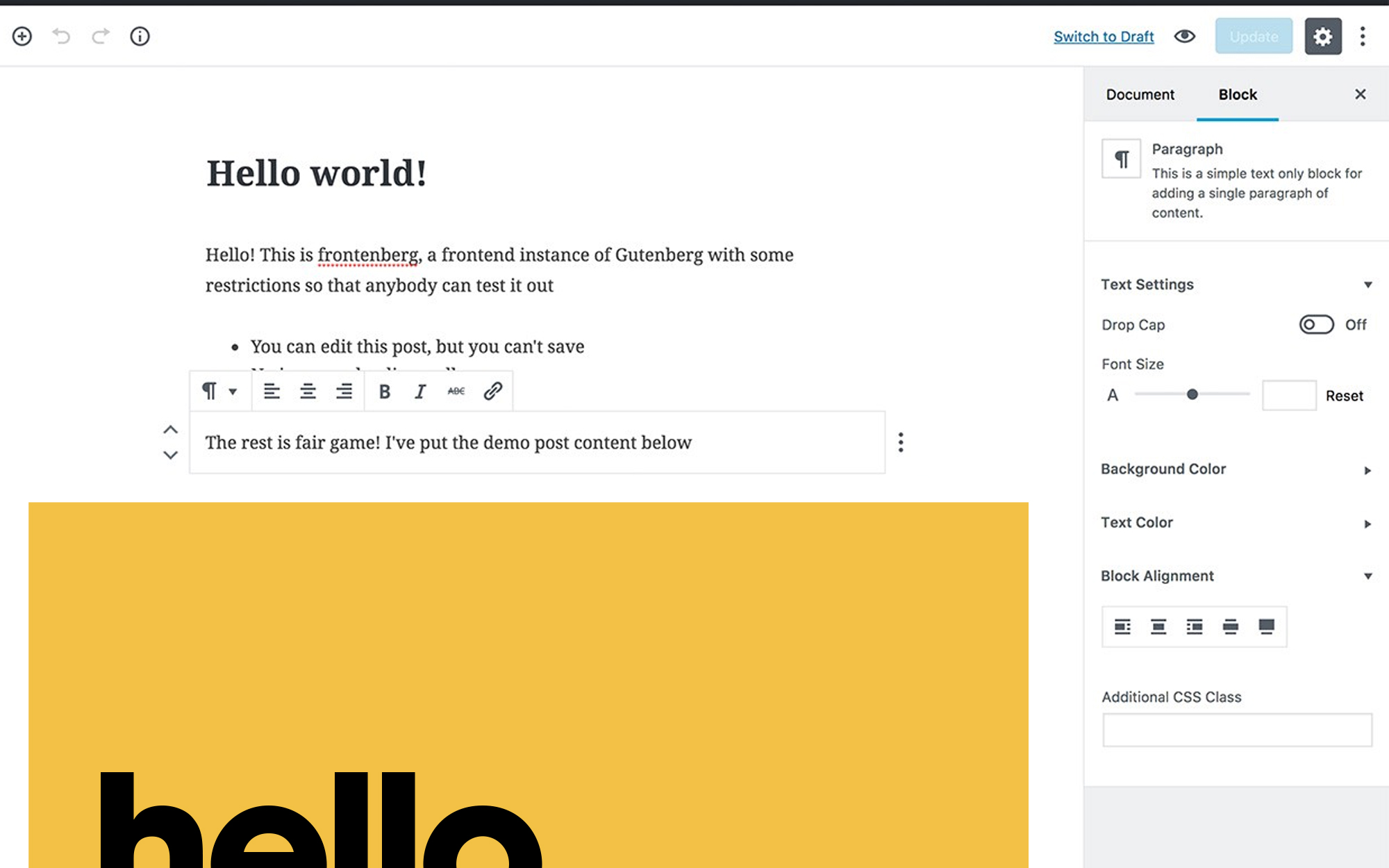
With the goal of broadening access to web presence, the WordPress development team shipped Gutenberg with version 5.0 on December 6th of 2018. Gutenberg is an intuitive, visual page builder which greatly improves the editing experience by allowing you to choose from an array of predefined blocks and simply dragging & dropping them into your page templates. While building your pages, you’re presented with a nearly identical representation of what your page will look like to your website visitors once published.
gutenberg highlights
gutenberg blocks
With the addition of Gutenberg blocks, our development team had to adjust the approach we were taking for component creation. Previously, we had implemented ACF’s Flexible Content field to provide the functionality we were looking for to easily create structured, reusable blocks. However, now that blocks have been fully integrated into WordPress core, we were able to tie our existing ACF fields directly into our custom created WordPress blocks which are much more modular than the previous flexible content components. Advanced Custom Fields now provides a handy location rule to assign custom fields to custom blocks allowing you to leverage WordPress’ visual editor while still maintaining control over the editing experience.
gutenberg layout
By utilizing one of Gutenberg’s built-in, layout element blocks called “Columns”, editors are able to create custom grid layouts thanks to WordPress’ adoption of flexbox in CSS. We were able to greatly simplify our component creation process so that each component could be plugged directly into a grid column, individually, instead of having to build out separate components or templates to accommodate varying grid sizes on each page. This became a huge advantage for our team as our web designers no longer had to navigate the complexity of varying grid sizes in their sometimes limited template designs (scope creep!!), and our developers were able to quickly build out components that would be reusable across all of our templates, out-of-the box.
The highlights mentioned above barely scratch the surface of the opportunities Gutenberg has provided to improve editing experiences all around. With a roadmap stretching throughout 2021 full of new projects and releases, you can expect the editor to only get better with time. We encourage you to learn more about how to utilize the editor on your website, or the websites of your clients, in order to save stress, time, and financial investments which can quickly start to add up during your website projects.
More
insights
Lorem ipsum dolor sit amet, consetetur sadipscing elitr, sed diam nonumy eirmod tempor.
©2025 300FeetOut All Rights Reserved | Privacy Policy