dev corner: tips and tricks for building admin panels (part II)

Chantel Keith
2 minutes
In our previous post of this series, we went over the importance of choosing the proper field types to accommodate your website’s layout and content. In this post, we’ll be discussing the just as important concept of cleaning up the admin interface.
2. The editor’s UX matters, too.
Organizing the admin panel efficiently improves not only the user experience of the editor but also greatly increases the intuitiveness of the user interface design. If you’re really thinking about your client, you’re thinking about their whole experience. Bonus points for you because it also means fewer questions and confusion along the way. We promise your editor will thank you!
Defaults aren’t always best.
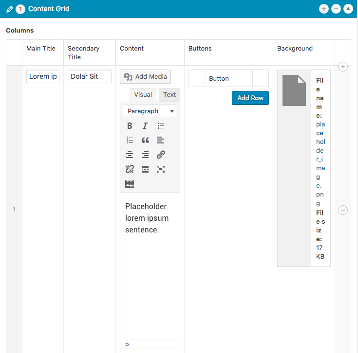
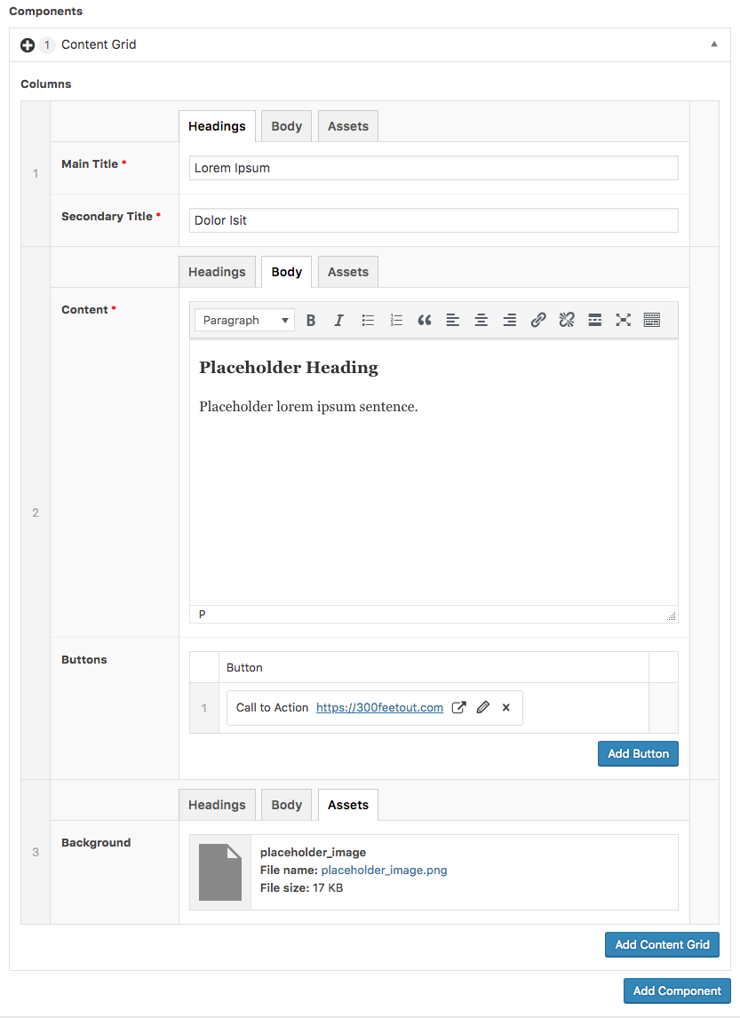
Advanced Custom Fields provides three different layouts for admin panel components: Table, Block, and Row. When creating a new field, the layout will default to “Table”. In our ‘before’ screenshot, we’ve illustrated what can occur if the default “Table” layout is left set and unconfigured. In contrast, the ‘after’ screenshot shows the Block layout being used, which neatly stacks the fields on top of each other. This provides the editor with ample space to easily edit their content and only takes a couple of seconds to configure when creating your fields.
Less is more.
Presenting your editor with a loooong list of fields, buttons, and tools can be overwhelming to them. Like a website user, the fewer clicks the better the experience for everyone. And although all of these fields may be necessary, we’ve found it very beneficial to neatly tuck fields away in groups to keep the UI clean and decluttered.
Along with the layouts we discussed above, ACF also provides various ways to group fields or content together: Accordions, Tabs and Groups. Although it will add a few extra steps to group each component’s fields, you can see how nicely the use of these cleans up the user interface. This is especially helpful when a component has many fields and/or rows as you can limit the number of fields presented in each row.
Be descriptive.
Repeater fields are great and provide important functionality for sliders, slideshows, grids, and the like, but they can quickly clutter your UI with various “Add Row” buttons so use your words. Be sure to label the “Add Row” buttons based on the type of content that is repeating, especially if there are several repeater-type fields on a page. This ensures the editor can easily understand and visualize what type of content they’re adding. As a bonus, we’ve found a clever ACF tool that adds the capability to collapse repeater fields which can really come in handy for those long-scrolling repeater fields with several sub fields.
In the final post of this three part series, we’ll be focusing on the infamous WYSIWYG editor offering recommendations on how to make the best out of its daunting editing experience.
More
insights
©2026 300FeetOut All Rights Reserved | Privacy Policy