UX 101: design principles pt 1

Bri Martinez
4 minutes
“People ignore design that ignores people.”
— Frank Chimero
It can be easy to be overwhelmed by the constant influx of information coming out about what User Experience is all about. Staying on top of new tools and new trends can be exhausting. Discovering that there are now 5 more new job titles that are just a small fraction of what you do is a chore. Amongst all of this, sometimes it’s best to just go back to the very beginning and remind yourself, no matter what you’re doing in UX, that you’re keeping the fundamental design principles in mind.
If you haven’t already, it might be worth reading a quick overview of how psychology and design are linked. But today, we’re going to have a crash course with a few design principles that are essential to keep in mind when designing. For more information on these, Jon Yablonski has an excellent resource that offers these “Laws of UX” more in depth.
Aesthetic Usability Effect
There’s a reason why designers strive to make a product look good visually. That’s because oftentimes, research has shown that a user will become more tolerant of minor usability issues if the visual layout gives a positive emotional response to the user. “The nicer it looks, the better it works” mentality comes into effect. This isn’t an excuse to make a site that has bad functionality or usability, but rather make sure that the quality of the site is matched across all areas of its design (functionality/usability = nicely designed user interface). This is also an important principle to consider when undergoing user research and user testing. Sometimes the way a website looks can help a user not be frustrated with its usability and drop off the site if it’s too difficult to complete a task.
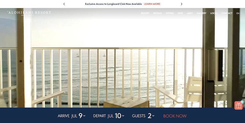
The ‘Alohilani Resort site provides a clean homepage with clear CTAs.
Doherty Threshold
As technology advances, we as users expect things to happen instantly. This also creates an addictive behavior when we use our computers or phones with a rapid response time. Known as the Doherty Threshold, anything that takes longer than 2 seconds (loading a webpage, app, etc.) will disrupt the user’s thought process. A user is already thinking about the next steps in the process before they even happen, and as a result this disruption can greatly reduce the user’s productivity in the task in relation to the response time it takes to complete. Best practices for this is to make sure that when designing, we make sure that optimization is taken into consideration.
Make sure your product responds quickly by optimizing all your assets (such as video) to ensure quick loading speed.
Fitt’s Law
Pick 5 random items in the room in various sizes. This could be a plant, a computer, a doorknob, etc. Then from where you’re sitting, point at the items and ask someone to see if they can guess what you’re pointing at. The answers may vary, but they’ll likely know which larger items you’re pointing at compared to the smaller ones. Now apply this same exercise to your website. This is an example of Fitt’s Law.
There’s a reason why companies now are creating prominent CTAs (they always should have been, to be honest), bigger font choices, and making important information overall easier to see. This is because the bigger and easier it is for a user to select options, the better experience they’ll have and a stronger likelihood of reaching their end goal. Placement and positioning is also important to consider as well. When designing for mobile, it’s important to position an important CTA somewhere easy for a user to navigate to. Same goes for desktop; you don’t want to put any important information in weird corners or in areas that it wouldn’t be commonly associated with.
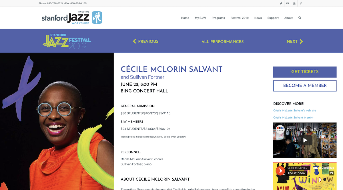
Stanford Jazz Festival’s Performance pages provide a CTA that’s easily located, with the Get Tickets now being noticeably prominent in its hierarchy.
Jakob’s Law
Jakob’s Law is applying the thinking that users expect your site to work like other sites that they’ve been on. That’s not to say that you should replicate it entirely off another one, but as an expert it’s worth knowing what works and what doesn’t fundamentally. If your site has a robust menu, then it’s worth creating a mega nav to help allow easier usability. Don’t place a logo in the far right of a header when users are most familiar with a logo being placed in the far left, and sometimes center. If you run a restaurant business, it’s probably best to have all your menus under one section of the navigation.
If you end up introducing too many new design patterns, or irregular design patterns, it’s going to increase the learning process for a user and encourage them to leave.
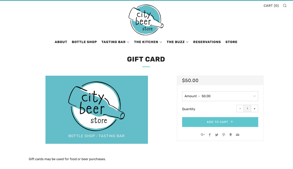
City Beer Store’s e-commerce experience uses a familiar layout that’s often used on nearly every e-commerce site, where the image takes on the left side while the product purchase info is on the right.
Stick around for part 2 where we’ll learn more principles that are fundamental towards creating a better user experience.
More
insights
©2026 300FeetOut All Rights Reserved | Privacy Policy