UX 101: Design Principles pt 2

Bri Martinez
3 minutes
“Design is not just what it looks like and feels like. Design is how it works.” – Steve Jobs
Picking up from part 1 of Design Principles, we’re going to take a step away from all the principles and go more into detail about the Law of Common Reason.
Law of Common Reason
Your brain sorts elements into a group if they are in a defined space. This helps create separation from the different areas on a page. As humans, we naturally like things organized, ordered, and grouped. In psychology, this is called the Gestalt principles. This skill helps make our lives a lot easier and simplifies a lot of the chaos that exists without it. We subconsciously like to find patterns in things and you can break that down to five distinct categories:
Proximity
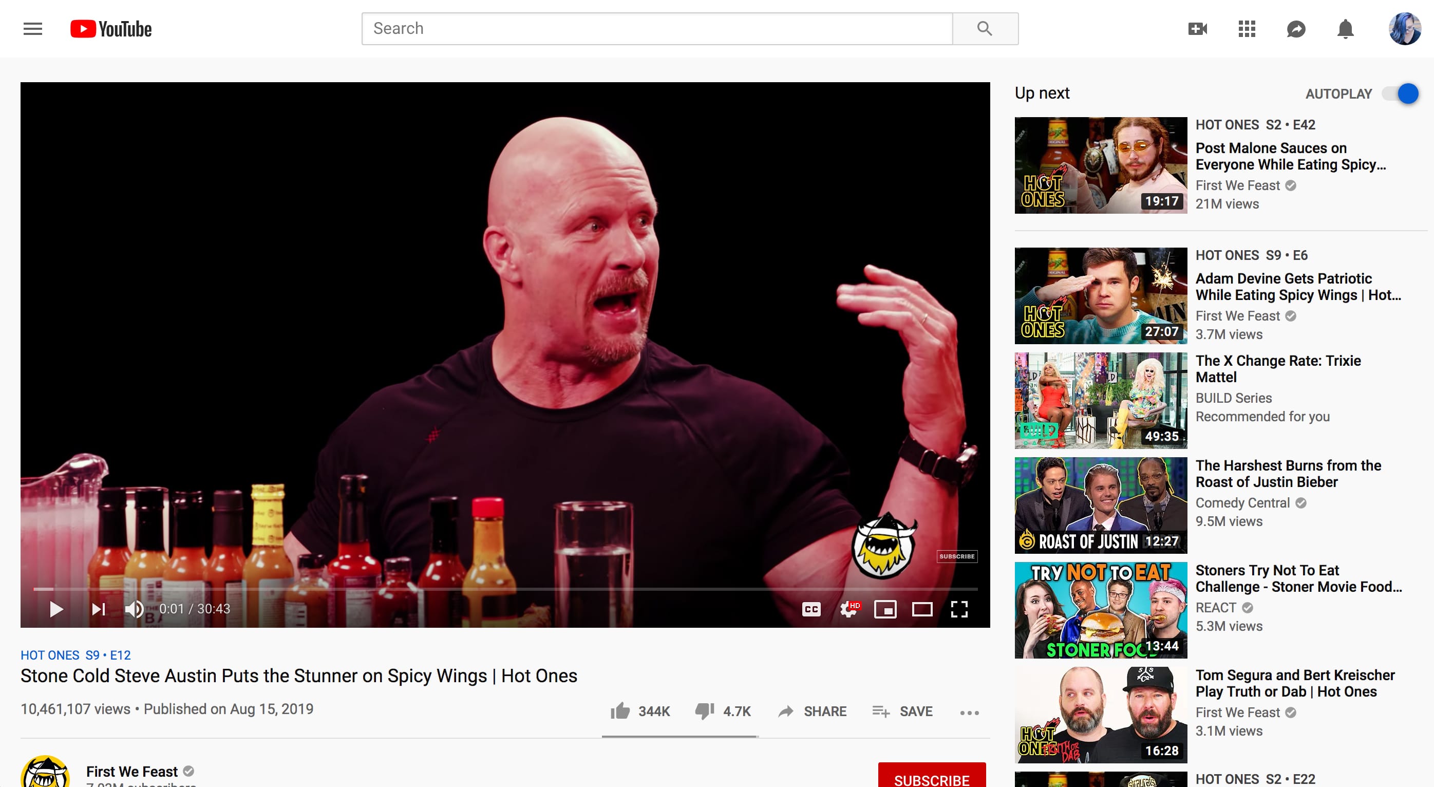
Items that are close to each other appear as grouped items, even if they are different shapes and sizes. For example, if you look on Youtube when you’re watching a video, they have the suggested videos related to the content in the sidebar.
Similarity
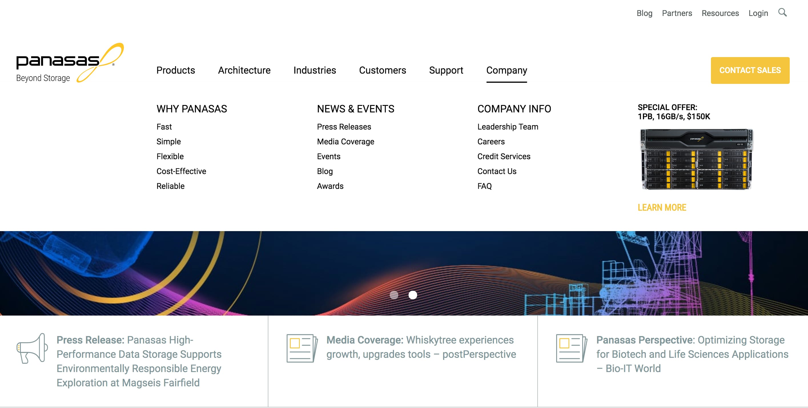
If items look similar, we distinguish those similarities that overlap with one another. This can be commonly found in the navigation of a website. When we’re designing a site map, we pay attention to pages that might have a similar theme or category and group them under a more high-level item that can become an umbrella category . For example, the image above shows the mega-nav on Panasas and how “Company” has sub-navigation that’s connected to the the main item but with different kinds of content.
Continuity
When our eyes start to follow something, it continues in that direction until a new item shows up. This can be something as subtle as an image facing towards typography or an arrow. On a website, you might have a scroll indicator at the top of the page to encourage a user to continue down, or arrows on sliders to make them understand that there’s more to follow.
Closure
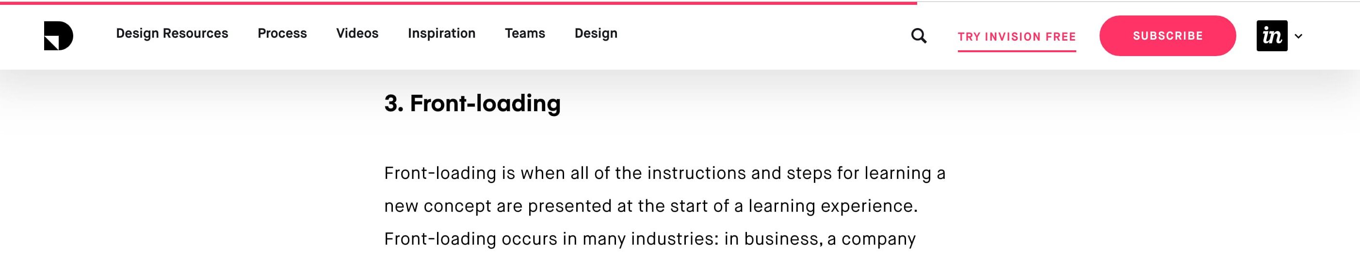
Our brains are able to fill in an image even if an object isn’t completely finished. A good example of using closure is when we create a shape playing connect-the-dots. We can often find examples of these on websites that have a progress bar, such as a step-by-step checkout on an e-commerce site, or an editorial site that features a progress bar that updates as you scroll down a post, like above the header on InvisionApp’s blog site.
Uniform Connectedness
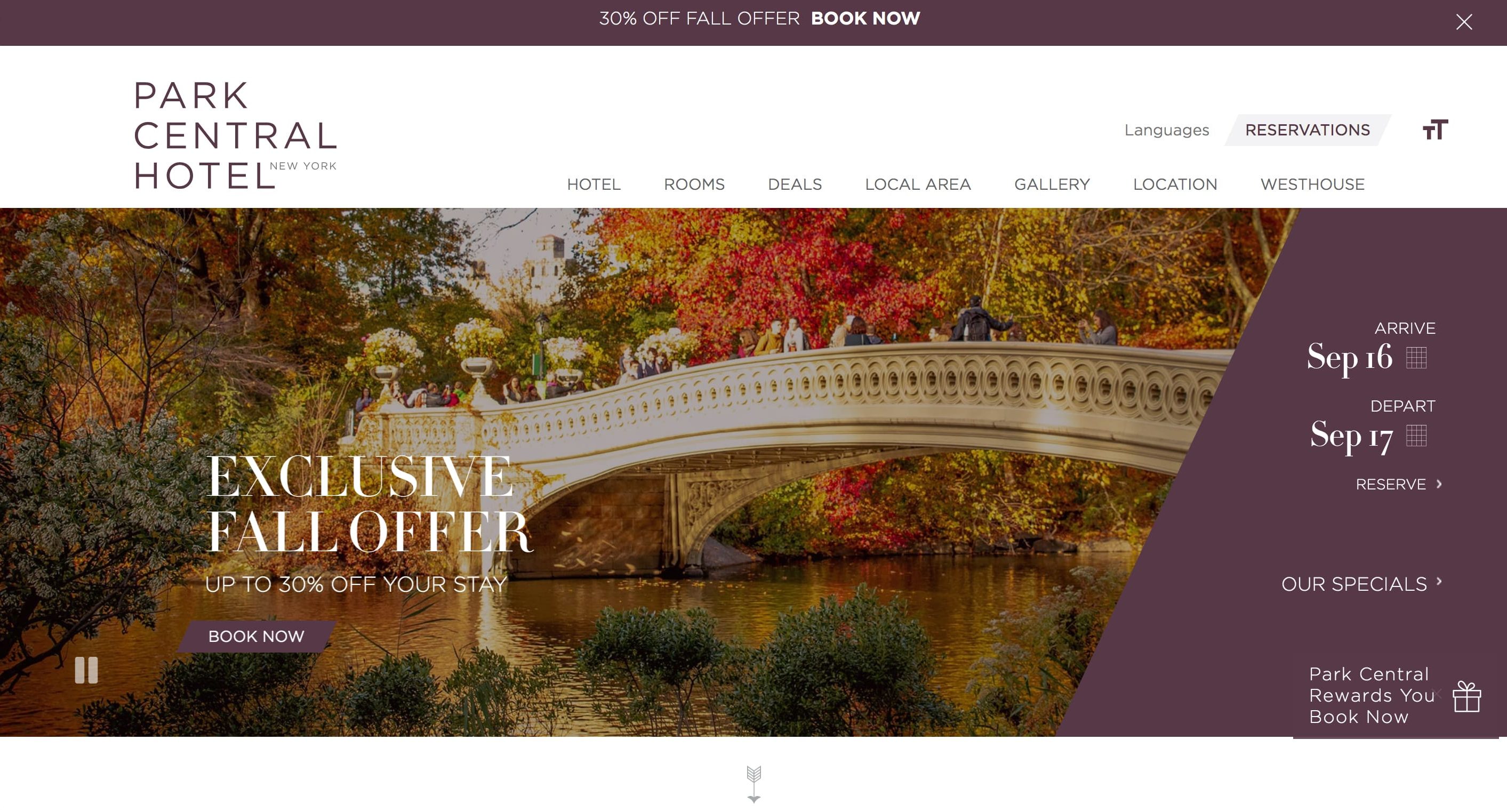
This is close to similarity and proximity, however uniform connectedness is when objects that are associated by uniform visual qualities are seen as being more related than objects that aren’t connected. This might sound a bit confusing, however a good example is when you have a container with different looking elements, but all pertain to the same purpose. Consider a booking bar on a hotel site: there might be different fonts and styles in the container, however its sole purpose is to help users book dates for the hotel stay.

Stay tuned for more rules of UX that are important to follow.
More
insights
Lorem ipsum dolor sit amet, consetetur sadipscing elitr, sed diam nonumy eirmod tempor.
©2025 300FeetOut All Rights Reserved | Privacy Policy