Designer vs Artificial Intelligence
Written by

Read time
Category
The long awaited Human and Computer Head-to-Head
A world without generative AI is a thing of the past. Whether you’re a blood sucking tech CEO drooling over increased profit margins from mass layoffs, or an independent creative losing hope in humanity and their own lack of artistic talent, the AI train is leaving the station and not looking back. As a designer at 300FeetOut, my colleagues and I have been asked many times what we see for our future as designers in a world more and more encapsulated by AI. Although I can’t see into the future, I decided to put this question to the test here in the present. Is AI currently a threat to my job security? Can Gen AI produce an outcome just as good if not better than a professional designer? Should I be questioning all my career choices up to this point? (Might be getting a little too existential with that last one, my bad.)
The Project
With these questions at hand, I needed a real world project to use as our guinea pig. The lucky winner was a logo project for our long time client ECS. The task was to create a logo for a new in-house restaurant called Julia’s at the MonteCedro senior living community.
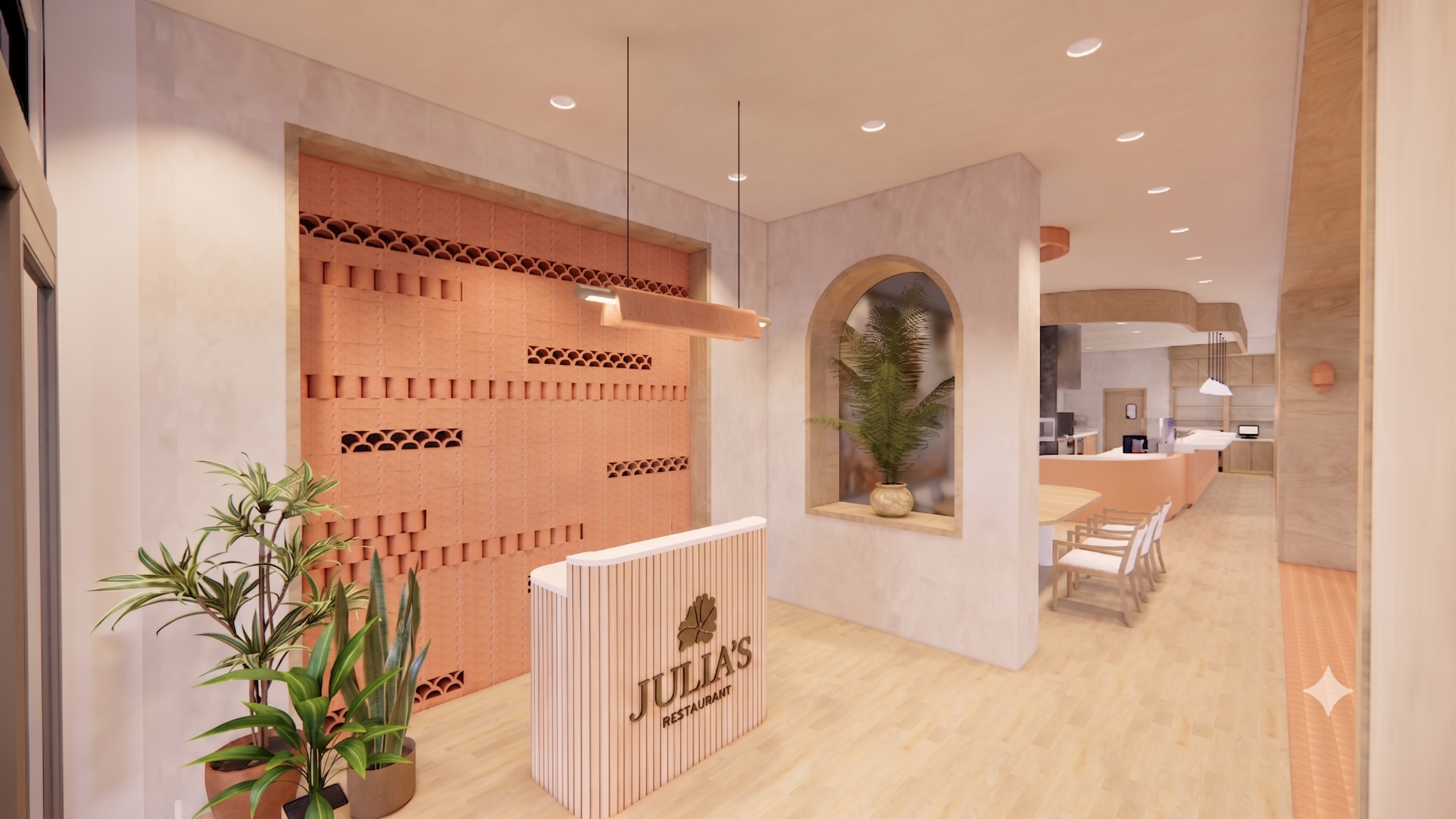
Named after California-based architect Julia Morgan, our client envisioned a smart casual atmosphere where you can bring the family for a relaxing meal or some friends you'd like to impress. The “California fresh” cuisine at Julia’s is defined as a melting pot of worldly dishes with American flair; incorporating influences from France, Italy, Mexico and more with seasonal and bright flavors. The restaurant interior is set to be primarily light and naturally colored (shown in renderings below) with pops of green or teal to coordinate with the dishware.
With a solid brief and lots to strategically explore, Julia’s was the perfect project for my greatly anticipated head to head with GenAI.
By the Designer
Before we ask our overlord AI to take on the task, let’s see what I can do with my old school, outdated skill set of original thought and humanity. After a few days of research, iterations, revisions, and internal reviews, the client was presented with three logo options for the restaurant.
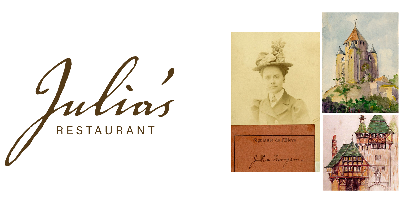
Concept 1: Signed, Julia
Throughout my research during this project, I was consistently drawn back to Morgan’s sketches and the hand-done nature and personality that seemed to be woven throughout her work. For this concept, I designed a reinterpretation of her signature that reflected the personality and texture. The delicate yet imperfect cursive felt sophisticated, light, and airy complimenting the restaurant space.
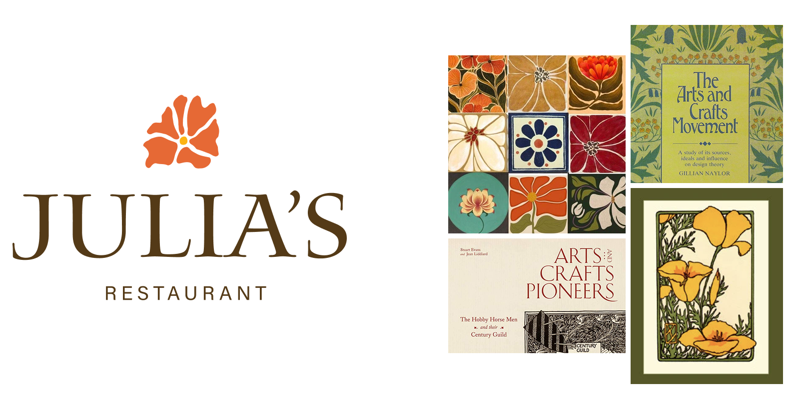
Concept 2: California Fresh
Julia Morgan was a large proponent of the Arts & Crafts movement. I reflected the movement's style through a poppy flower evoking California flora and vegetation connecting to the “California fresh” menu at Julia’s. The typography mirrored that of the movement feeling hand drawn while still elegant and sophisticated.
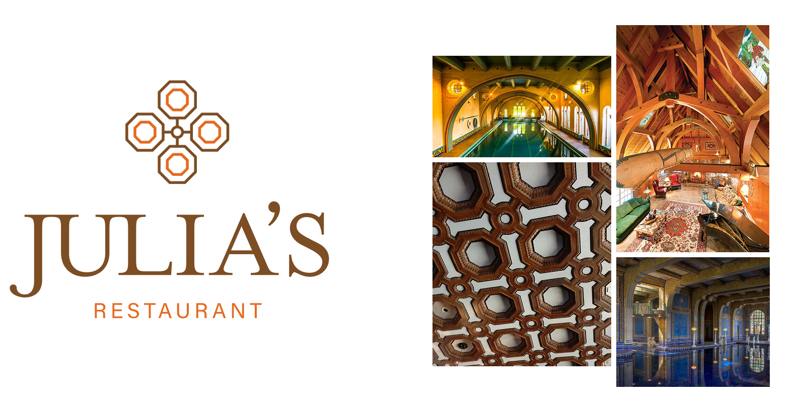
Concept 3: Building Connection
The final concept took inspiration from Julia Morgan’s architecture portfolio and her use of arches and geometric shapes. The connecting octagons reflect design elements of the Julia Morgan Ballroom in San Francisco while also symbolizing connecting table-like shapes representing the building of connection through a shared meal. The serif typography is clean and sophisticated as well as very geometric, pairing well with the table motif above.
Now while I did all the heavy lifting, I couldn’t leave my bestie AI out of the entire process! Gemini helped to mock up each logo on the hostess stand in the restaurant rendering. While not the most refined, it did the trick in helping everyone better envision the logo in the space and also saved me a solid 20-30 minutes.
By GenAI
Now that I’ve poured my blood, sweat and tears into this project, let’s see how it holds up to the power of AI; first up, Google’s finest offering to the AI gods: Gemini. I gave the model everything I had to work with: project brief, menu draft, and the restaurant renderings, and asked it to design me a logo for a restaurant called Julia’s.
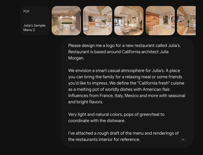
Oh, and a rather sizable asterisk here, we have a Gemini Pro account which means Google cannot train their models off of any of our company’s Gemini chats. Yes, they have found a way to charge people to not steal their info, can’t say I’m surprised. So if you are using the free version, just know your info is being injected straight into Gemini’s veins whether you like it or not.
With that said, Gemini now has all the non-trainable info for the logo and after about a minute gives me this:
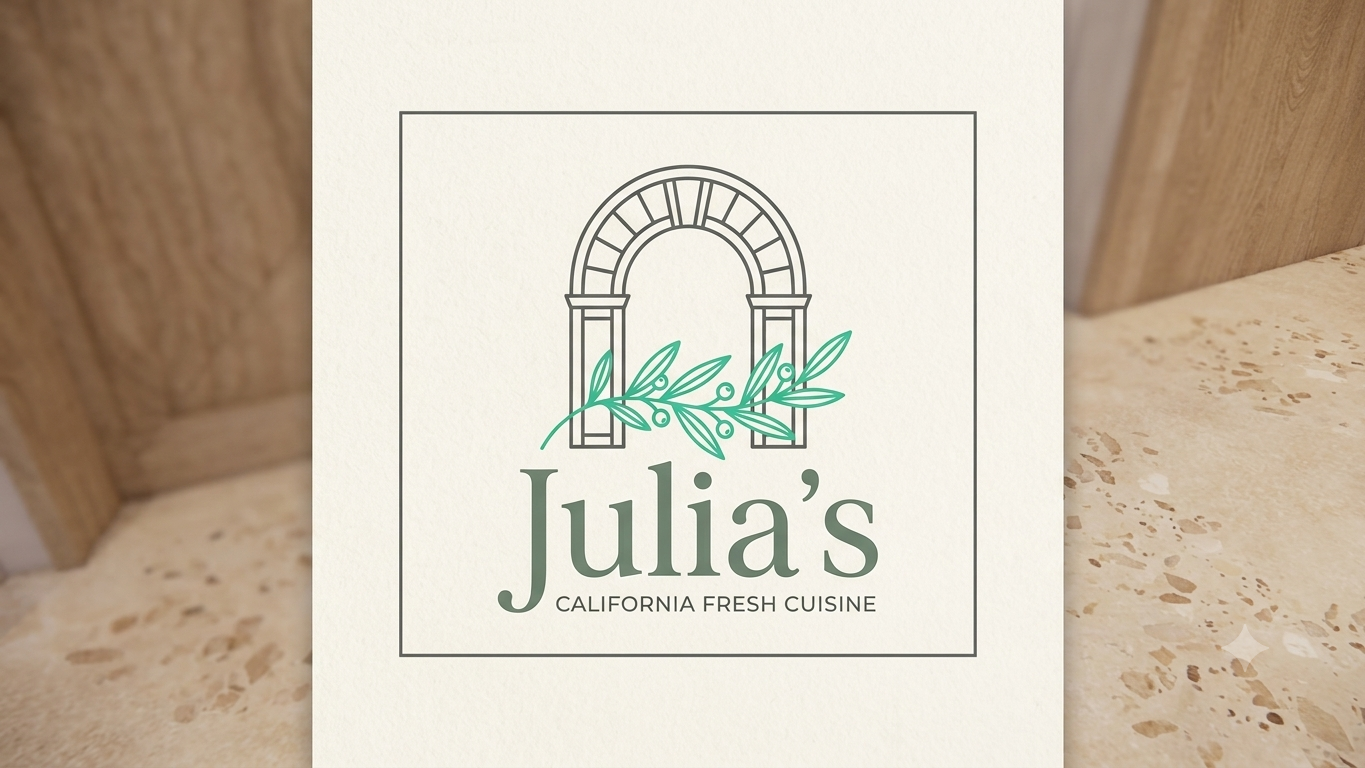
The image is all it gave me. There wasn’t any sort of reasoning or explanation for the choices made so I asked it to outline the reasoning behind the design choices. Here’s what I got, straight from the immaterial horses mouth:
1. The Architectural Centerpiece (The Arch)
The Rationale: Julia Morgan was a pioneer of the American Craftsman and Mediterranean Revival movements, famously incorporating grand archways, exposed structural elements, and classical geometry into her work.
The Connection: Look closely at your restaurant's interior renderings—arches are the defining architectural motif of the space. They frame the entry wall, the kitchen pass-through, the banquette seating, and the transitions between rooms. The clean, line-art arch in the logo directly mirrors the physical structures your guests will walk through, establishing an immediate sense of place.
2. The Botanical Overlay (The Olive Branch)
The Rationale: You defined the culinary concept as "California fresh"—a bright, seasonal melting pot influenced by Italy, France, and Mexico.
The Connection: An olive or laurel branch is the perfect visual shorthand for this concept. It nods directly to Mediterranean-style climates and European culinary roots, while symbolizing freshness, abundance, and organic growth. It softens the rigid geometry of the architectural arch, striking that exact "smart casual" balance you are looking for.
3. The Color Palette
The Rationale: The prompt requested very light, natural colors with pops of green or teal to coordinate with your dishware.
The Connection: * The Background: A soft, warm off-white/cream that matches the light plaster walls and natural travertine-style floors of the interior renderings.
The Arch & Typography: A muted, earthy charcoal/olive tone that feels grounded, upscale, and structural without being as harsh as pure black.
The Branch: A vibrant, crisp teal-green that provides that requested "pop" of seasonal brightness. It will tie in seamlessly when stamped on menus, signage, or paired with your actual tabletop dishware.
4. Typography & Layout
The Rationale: The restaurant needs to feel approachable for families but sophisticated enough to impress friends.
The Connection: * The font for "Julia's" is a refined, contemporary serif. It carries a sense of history and structural elegance (befitting an architect) but keeps clean lines so it doesn't feel stuffy or dated.
The tagline "California Fresh Cuisine" uses a clean, geometric sans-serif font. This brings in a modern American flair, ensuring the brand feels current and fresh rather than purely historical.
The square border frames the logo like an architectural blueprint or a framed piece of art, mirroring the clean zoning seen throughout the dining room layout.
Now before we compare this logo to the one I made, let’s do the same process but with another model, in this case, ChatGPT. Ah yes, the model that started it all. A pioneer in consumer facing chat models, and a pioneer in establishing partnerships with the Department of War. You really can have it all!
Now a quick note, I am not using a paid version of ChatGPT which means I cannot block the model from using my info for training, unlike with Gemini Pro. Therefore, I won’t be uploading any reference files to the model to avoid this. It will still have to full brief to work with which should be plenty for our purposes:
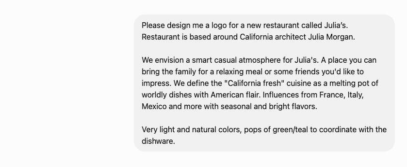
With that info, the model gave not one but TWO logos to choose from. Here’s the rational it gave me for each:
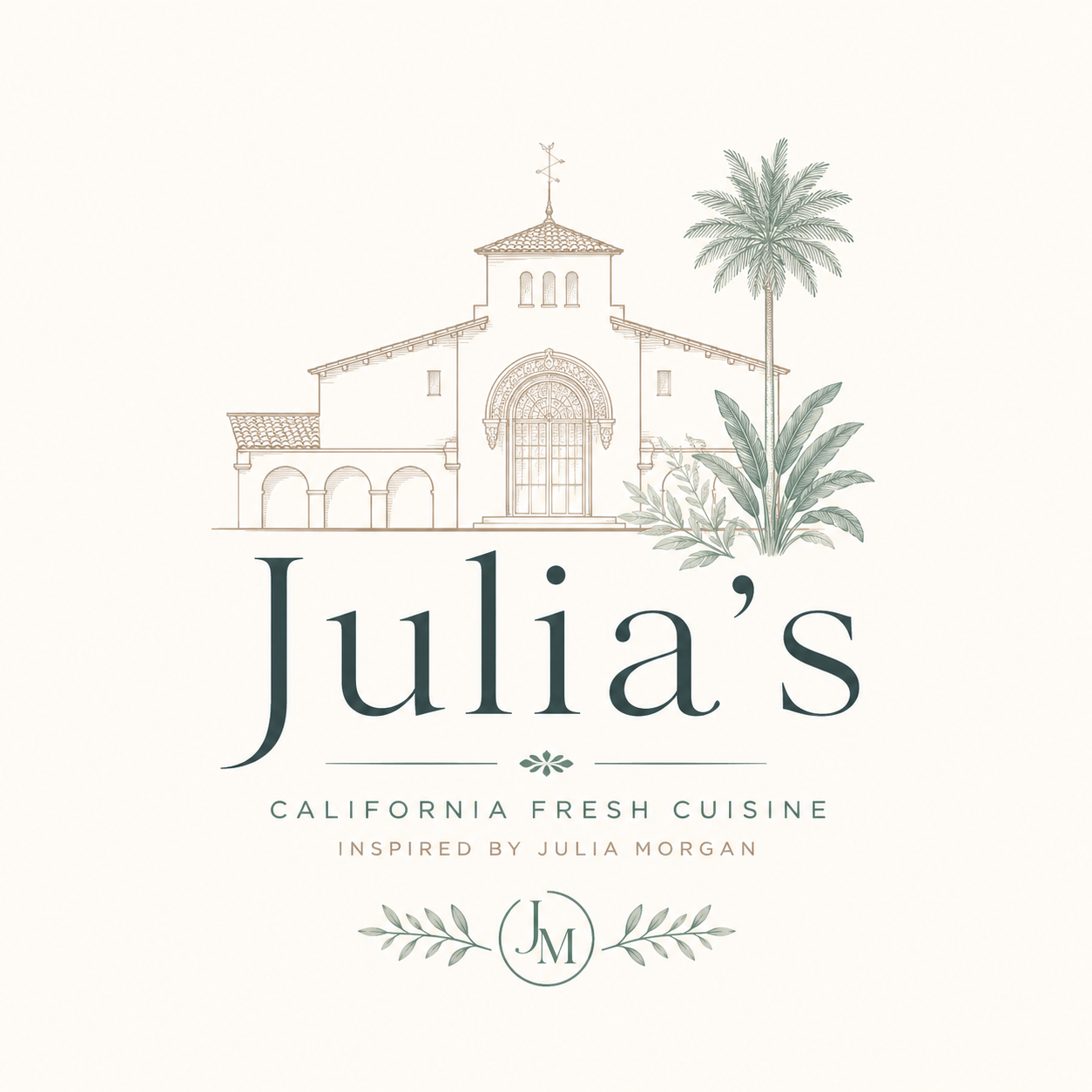
This concept emphasizes Julia Morgan first, restaurant second.
Why the architectural illustration?
Julia Morgan is one of California's most celebrated architects, so the building immediately creates a connection to her legacy.
The line-art style references architectural drawings and blueprints without feeling literal or historical.
The Spanish Colonial/Mediterranean architecture also evokes California, which supports your "California fresh" concept.
Why the serif typography?
A high-contrast serif communicates sophistication and timelessness.
It's refined enough for a dinner date but still approachable—matching your "smart casual" goal.
The large scale gives the restaurant name confidence without relying on decorative elements.
Why the muted palette?
Warm cream and sand reference California stone, plaster, and sunlight.
Soft teal provides the "pop" you mentioned while feeling fresh rather than trendy.
The botanical greens reinforce seasonal ingredients.
Why the botanical monogram?
It gives you a secondary brand mark ("JM") that could work on menus, coasters, napkins, or social media.
Olive branches subtly reference Mediterranean influences in your cuisine.
Strengths
Feels established and upscale.
Strong storytelling.
Works well if the restaurant interior also references Julia Morgan architecture.
Potential weakness
The building illustration is quite detailed, so it may lose clarity at small sizes (business cards, social icons, embroidered uniforms).
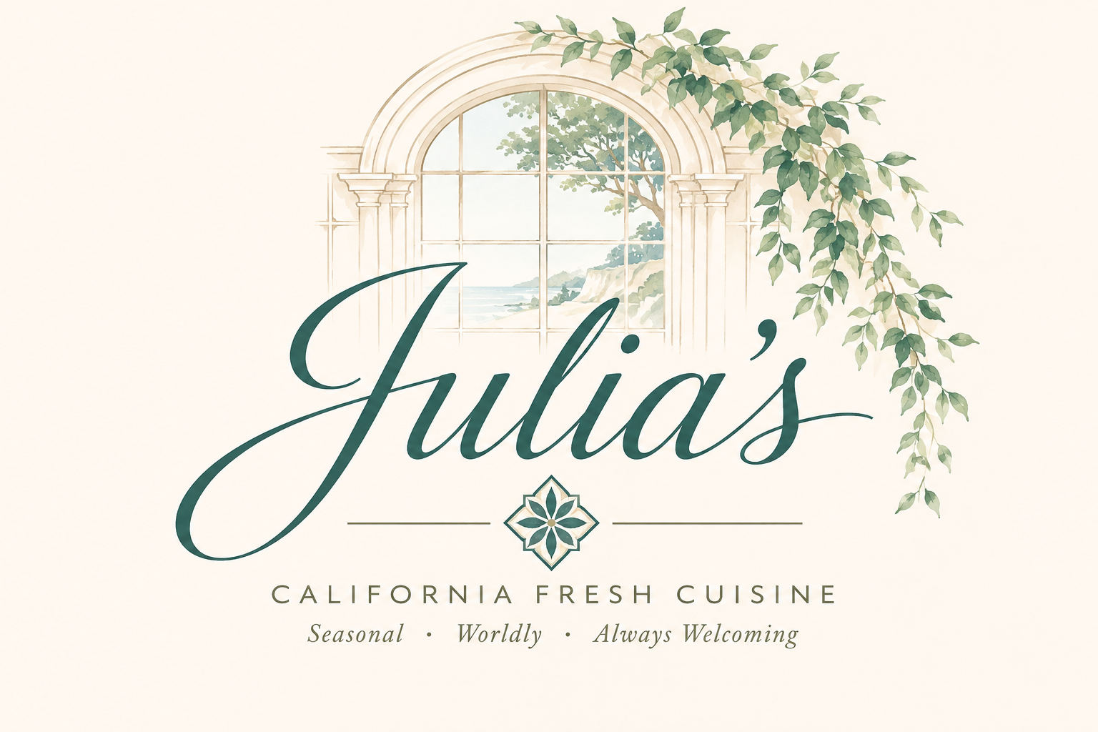
This version shifts the emphasis to the dining experience rather than the historical inspiration.
Why the script logo?
The flowing script feels welcoming and personal, almost like a signature.
It softens the brand and makes it feel family-friendly while remaining elegant.
Why the arched window?
Instead of showing an actual building, it suggests architecture through an architectural element.
The window frames a California landscape, connecting architecture with the outdoors.
Why the watercolor treatment?
Watercolor feels fresh, airy, and natural.
It echoes seasonal produce and California's relaxed lifestyle.
It creates an emotional rather than literal connection.
Why the vines?
They reinforce freshness and hospitality.
They help balance the composition while softening the architecture.
Why the teal script?
It coordinates well with your dishware idea.
It becomes the visual focal point against the neutral background.
Strengths
Warm and inviting.
Memorable.
Appeals to families while still feeling special.
Potential weakness
The script is quite expressive and the illustration more painterly, which can reduce legibility and scalability compared with a simpler mark.
Let’s Review
Now I have to say, the output for each wasn't half bad. Both picked up on a lot of thematic elements I had also explored; nods to Morgan’s architecture, the California fresh menu, still it truly didn’t wow me. The overlapping linework in Gemini’s felt out of place and there’s no way it would print tiny on a menu. Plus, this seems more like a logo for a vineyard rather than a restaurant. The type needs some refinement and looks out of place next to the thin linework. Sophistication overall was not at the level it needed to be.
The two logos from ChatGPT had similar issues. While winning in the illustration department, both logos are even worse off than Gemini when it comes to printing at small scale. Plus, they both felt more like a logo for a hotel or resort. The type was stronger than Gemini’s and the overall sophistication was taken up a notch. Still, they both followed the same layout formula. A detailed illustration, followed by expressive typography, with supporting text and a weird little floral symbol underneath. When a model has been trained off the illegal scraping of the entire internet, you think you’d get a bit more variety.
Most of all though, both didn’t give me anything new. Despite prompting two completely different models, their outputs were mundanely similar. As a designer, part of my job is exploring beyond the initial task and presenting ideas the client maybe didn’t think of. AI fails to push the boundaries of the brief and therefore fails to discover anything rare or meaningful even if it is checking boxes. Sure, AI’s output nails the prompt, but it fails to ask any further questions. What if we used a pop of red instead of teal? What happens when we use motifs from the greater artistic movement Morgan praised? How can we tie the logo back to the experience of dining? AI doesn’t ask these questions, a designer does.
So who won? And who’s next? You decide.
The reality is many people would probably be perfectly satisfied with the AI generated logo. It checks all the boxes and fits the general look and feel of the restaurant. But that’s kind of it. Like any mathematical learning model, AI gives you the average, like a proud C average student. You won’t see AI pushing boundaries or asking new questions that ultimately elevate your brand or logo simply because that’s not in its job description. AI plays it safe and where would we be if all the great artists in history had just played it safe? Not a world I want to live in.
With that being said, as a designer, I don’t think AI is completely useless. It can sort through and organize dense information faster than I can and bring still images to life when the client doesn’t have the budget for a videographer. But without the human touch and direction of a designer, the limits of AI become quite clear.
So should I be scared of losing my job to the newest, coolest tech in town? At the moment, I think I’m safe. The future of AI is ever changing and in a few years I may eat my words but at the moment I have a lot to offer that AI can’t. The power to push beyond and think outside the box will always be essential and AI may not be cut out for the job. So go spend a couple hundred thousand dollars on an art degree, kids! When there’s no replacement for the crazy, beautiful mess of the human brain, how could it not be worth it?
More
insights
©2026 300FeetOut All Rights Reserved | Open Positions | Privacy Policy